
Negative Horizons
I had very pleasing news just as I was leaving town earlier this week. This photograph of mine placed as a Jurors Selection in a diptych photography competition. The competition was called Same But Different and was put on by the New York Center for Photographic Art. You can see the gallery with my photo in it here (but you won’t be able to view it on any flash-challenged devices like most smart phones and probably some tablets too).
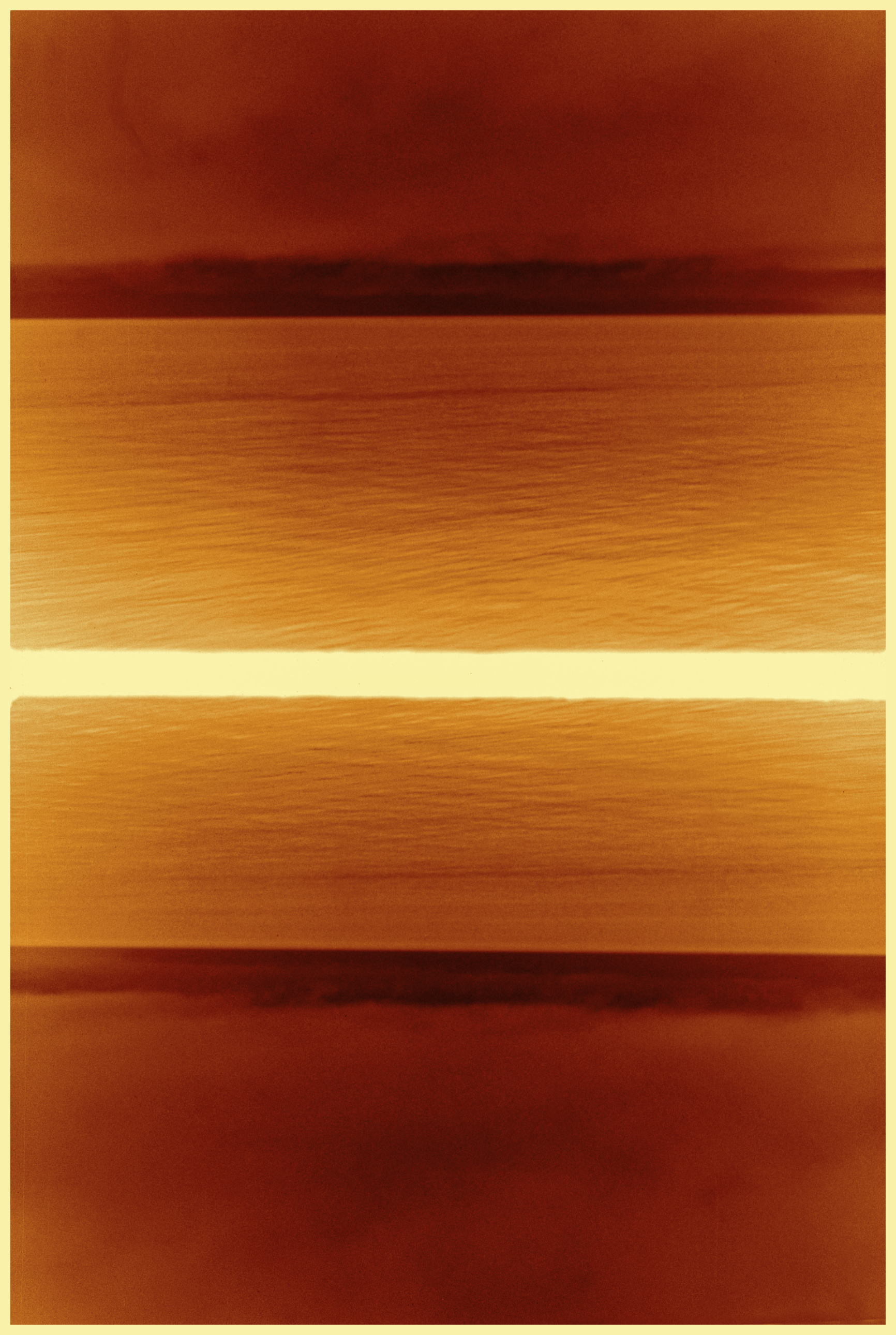
Many of you will recognise this photo, which I call Negative Horizons, as part a fliptych in my Horizon(tal) series, other versions of which were posted here.
.
I have to thank Melinda Green Harvey for bringing this competition to my attention, and several others of you for your encouragement of my slide into analogue photography and multiple frame images.
I’m off doing some research in the field for a few days with intermittent access to the internet. If I am slow getting back to any comments you might leave that is why.
.
Olympus Pen, half-frame camera, Efke KB50, ISO50, 1/50th, ~f5.6.
.
.


Congratulations and well deserved.
LikeLike
Thank you Andy, I made a last minute switch in my selections to include this shot (the others were all black and white) based in part on a comment you made when I posted some of these a few weeks ago. So, thanks for your influence!!
LikeLike
Always glad to offer an opinion. I just loved those orange versions – something very special about that tonal range .
LikeLike
Congratulations!
LikeLike
Thanks Laurie!
LikeLike
Congratulations on your fine accomplishment! I agree with Ken – your work fit right in with the other great images in the show. Keep up the good work!
LikeLike
Thanks Melinda! And thanks for letting me know about it. It is very encouraging to get this kind of support, both from a fellow blogger thinking I should apply, and from the judge selecting my photo onto a short list of sorts.
LikeLike
As we’ve mentioned (many times), our blogging community is a wonderful, if unexpected, benefit. I am glad that this contest went well for you!
LikeLike
It looks a lot like an abstract painting. Congrats on the competition news.
LikeLike
Thankyou Ben. The abstract aspects are what please me the most about this image, and that it has come out of such a small and long neglected camera, found for $3 in a thrift store. It is all very pleasing!
LikeLike
Congratulations!
LikeLike
Thanks!!!
LikeLike
Congratulations on the entry. It looks like a tough competition as there are some wonderful photos on the site and this fits right in with them.
LikeLike
Hi Ken – thanks so much. I am very pleased to be in this company – it is reassuring, and shows me that some other people out there are thinking along similar lines to mine, which is also reassuring. I am glad you think my work fits right in!
LikeLike