
Black & White Spring

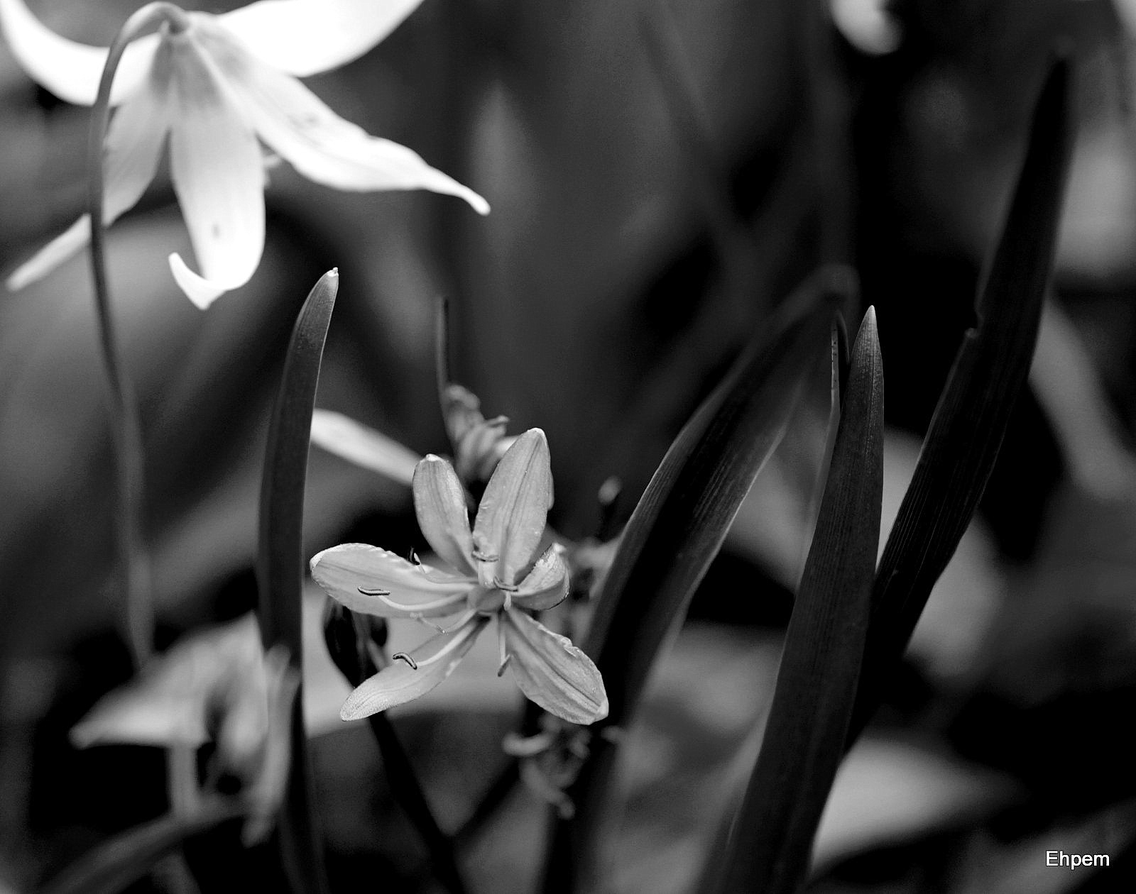
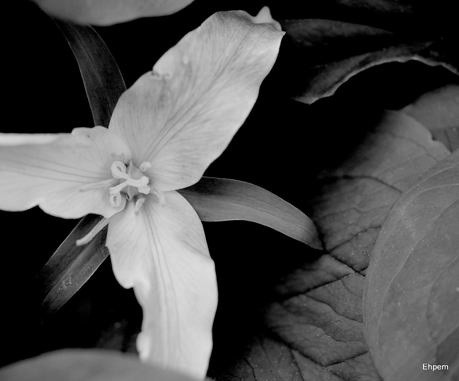
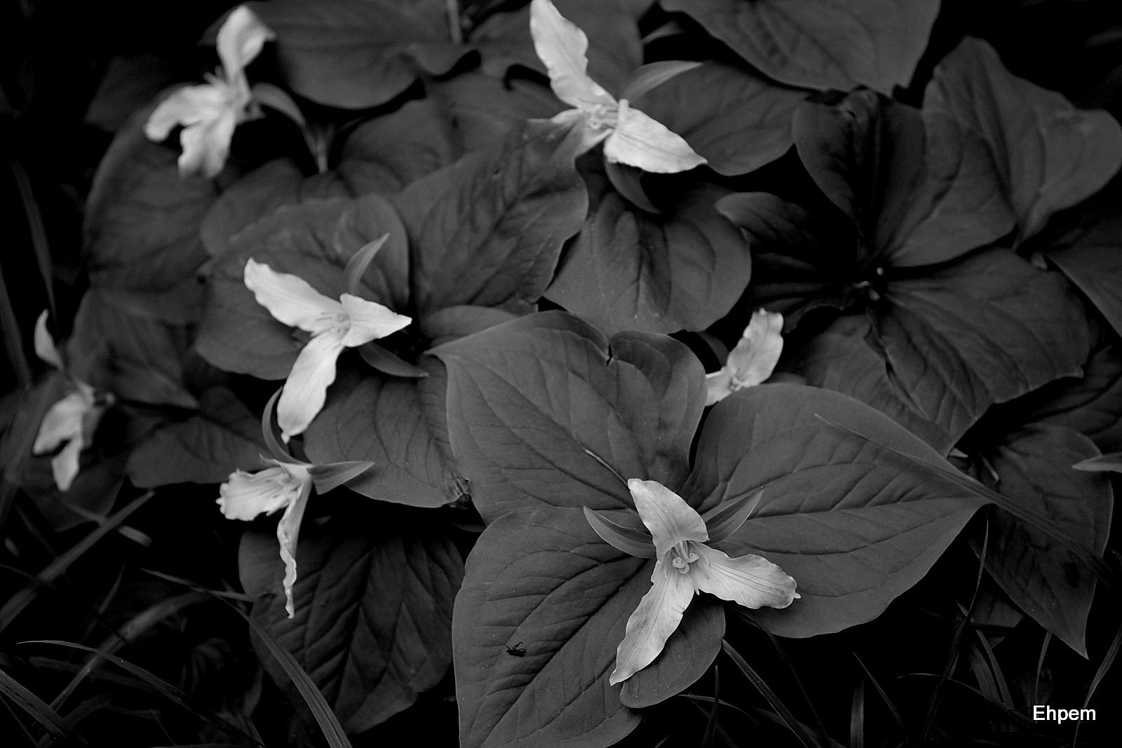
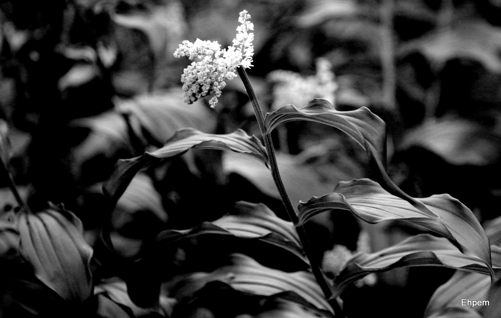
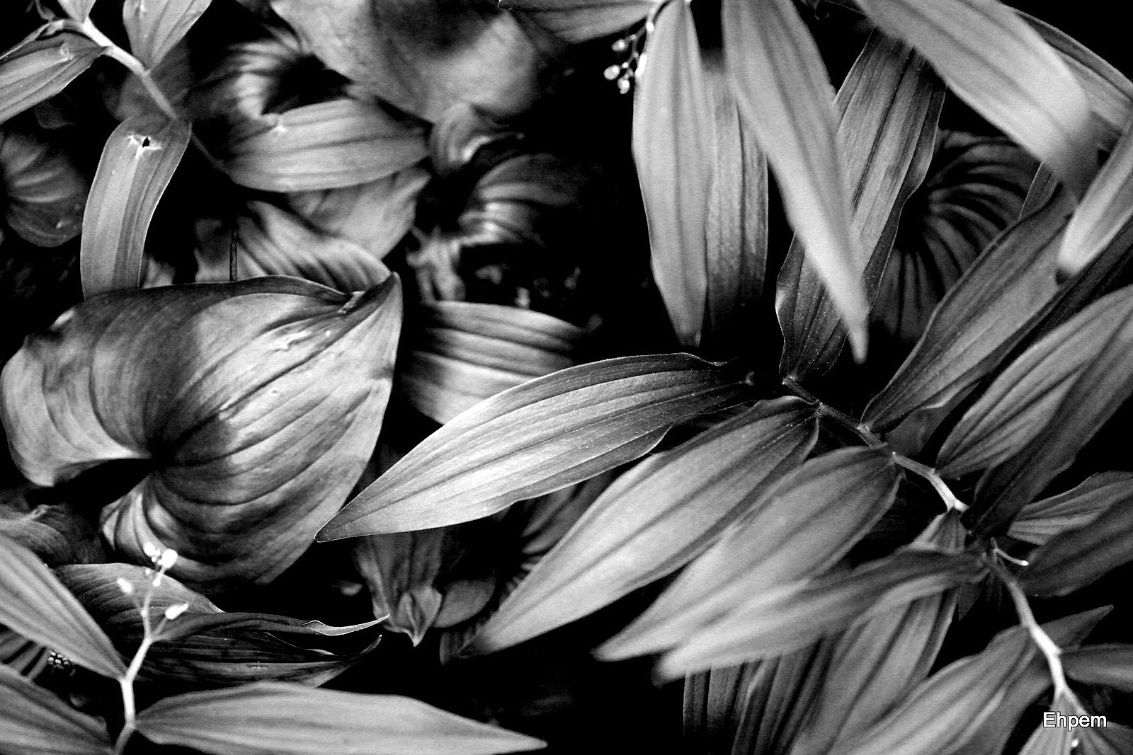
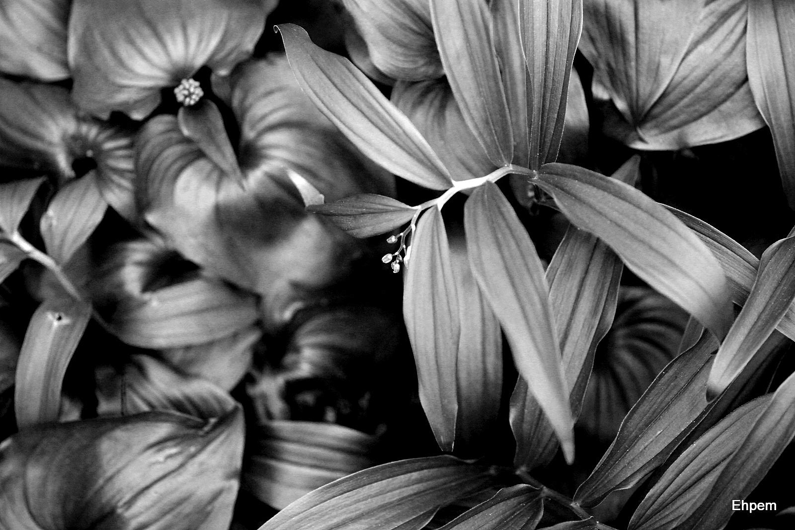
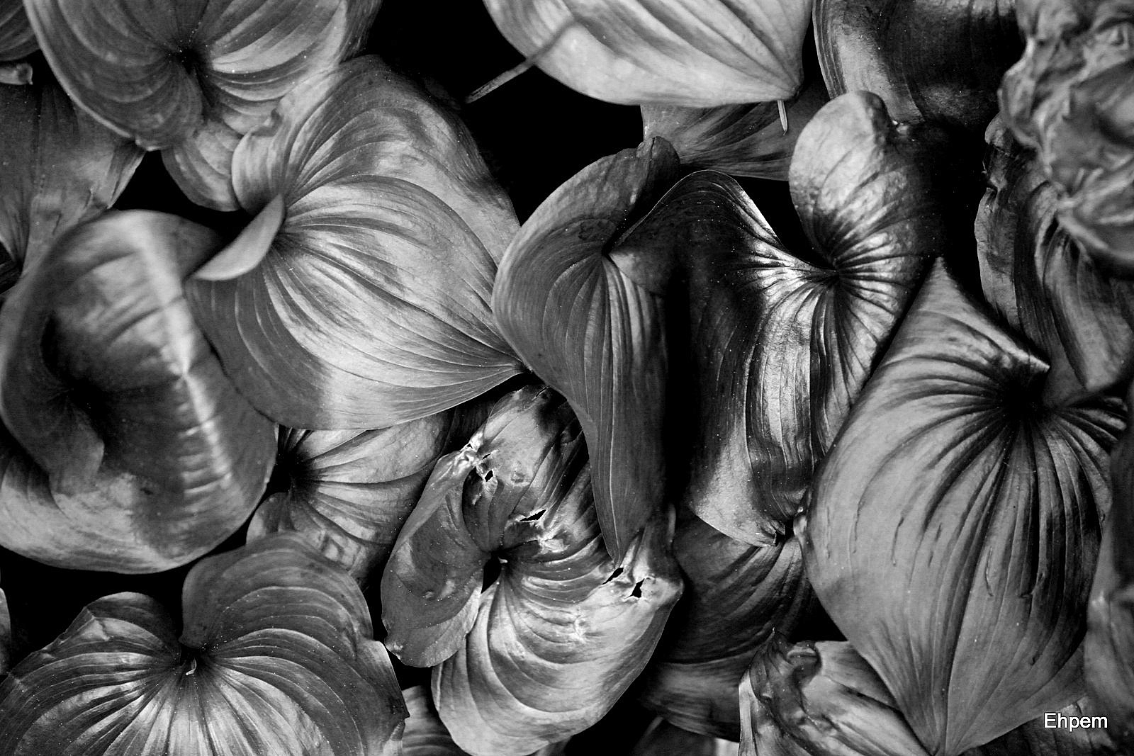
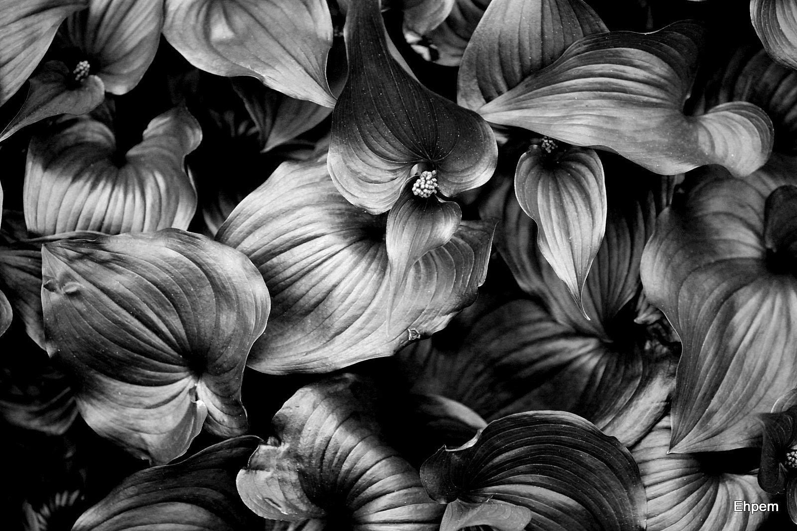
Today’s post features spring flowers and vegetation in monochrome. The shinier round leaves were carpeting the ground of the Oak Bay Wildflower Garden last Friday evening. I found that the colour photos did not display the reflected light the way I had hoped so tried them in black and white, to better effect. That led me to try some of the flowers as well; something a bit different from the joyous colours marking the passing of winter. But they give the same message – these are not things one sees in the winter. I just said with some confidence that these are better, having seen the colour versions, at showing the light I was trying to capture. However these images are processed quite heavily and pushed into a contrasty territory that I usually stay out of, so I am not completly comfortable putting them forward. I expect I will hear from you either directly, or by your silence, about whether I got anything right.
My own favourites are the photo above for its leafy bokeh, and the ‘swirling leaves’, second in the gallery, for all the movement in the shapes of the leaves.
The Oak Bay Wildflower Garden is a large city lot donated to the municipality many years ago to be used as a native plant garden. It is located at the corner of Margate Avenue and Beach Drive and has many different wildflowers in it. My purpose in going was to help out with the Quimper Hitty blog, which I understand will be featuring wildflowers from this location for the next week or so.
I am displaying these photographs in a gallery today, which I think is probably the best way to display them. Click on any image below to launch the gallery, navigate with arrows on either side and press escape key to return to this post.


EDIT: In the past I have commented that the quality of my images is only as good as the calibration and original quality of your monitor. Monitors can be calibrated if they are out of wack, and if you know this is needed. To that end I have added a grayscale bar to the top of my footer area below which should help you determine if you need to do something about it. If you click on the grayscale, it will launch a slightly larger version.
I got this idea from David A. Lockwood’s great photo blog Oman in Monochrome, and he generously helped me set one up here too. Thanks David – it is very much appreciated. I encourage everyone to check out his great photos of Oman taken with larger format film and scanned into digital format. He shows off-road views of a part of the middle east that we don’t normally get to see.
For a map of this location see this link (be prepared to wait for a while as the pictures linked to the map take some time to upload).
Canon 5d Mark II. Images taken with Takumar 100/4 Macro lens. ISO1000 and 800. Exposures 1/160th to 1/500th.
.
.


I like the B&W treatment here…well done!!!
LikeLike
Thanks David. It is pretty new territory for me, doing this to vegetation, though a few months ago I did something similar to dried old ferns, they were pale brown, almost silver and notlush green like these ones.
LikeLike
Ephem, those hostas are glorious! The tones are extremely beautiful.
LikeLike
Hi Karen – thanks so much. I am not sure that they are hostas though – it is a native plant of some kind, perhaps Maianthemum dilatatum which has a variety of unsatisfactory and confusing common names.
LikeLike
I took a course in black and white printing (many, many, many years ago) and it was required that we use Marshall’s SpotTone to retouch dust and small highlights off the subject or we would loose credit on the assignment. They still make this stuff for photographic printers and it’s still a requirement in spotting. But again, this is a personal and sensitive subject. Digital spotting is a lot easier these days and there isn’t a photo I have posted that hasn’t undergone the brush. Since I shoot RAW and use the Spot Removal Tool in Lightroom, all the retouching is non-destructive. We use the same technique on the Museum photos. but only on the background.
LikeLike
Long ago I had a darkroom and also had to do some retouching. But not much as I was really a very low level user and only too a really basic course to get me started. I have no issues with cleaning up sensor artifacts that would not be there if I kept it dust free (somehow). I have used the clone tool a couple of times to remove something that otherwise ruined a shot (like an orange street cone in a serene and otherwise green street shot). And for this one, I see David’s point entirely, even though the white specks are something natural that has fallen onto the leaves, I think the pictures would be best without them. If I had been thinking b&w with loads of contrast when I took the pictures, I suppose it might have occured to me to frame those kinds of things out of the shot. It is in any case really interesting to think about this, and to get input from others that have been there already, so thanks!
LikeLike
Exactly the kind of contrast I love in B&W !!
LikeLike
Hey thanks Mathias – I can see that in your images, maybe you are part of my inspirition for this treatment. It is not something I would have thought to do last year.
LikeLike
I have edited the post to add a grayscale to my footer and to credit David A Lockwood with the idea and for his help in getting one set up here too. Thanks David!
LikeLike
You are very welcome and glad I was of some help – thanks for the very kind comments about my blog.
David.
LikeLike
I really appreciate what your blog brings to me through images – it is an important antidote to the single-minded and biased information about the middle east (for want of a better word) that pours through our lives thanks to the press.
LikeLike
Wonderful! I love the black and white. The contrast really shows.
As for post-process, I wouldn’t worry about it. I tend to think of photography like I do paintings and poetry – sometimes they need an edit and retouch!
These images are great. I especially love the lily at the end.
LikeLike
Hi Ryan – edit and retouch for sure. There is the business of redoing something that is already published. For instance I agree with David about the white specks, but should I redo them in this published post and erase the old ones? I am not a journalist, so maybe it does not matter. And if it improves the images, well, that is a good thing. On the otherhand, there is the matter of forward momentum, which can be slowed down by going over the old stuff and improving it….
The fawn lilys are among my favourite plants – they are very elegant and graceful and photograph well in any medium.
LikeLike
And I should have added that in that last photo what I particularly like are the upright camas leaves.
LikeLike
They are beautiful. I think lilies might be my favorite in all of their variety. I don’t know if I can narrow down to just one. Although Tulips might beat them by just a hair – especially orange ones.
As for correcting and republishing – I’m all for it. Some of the best works were composed throughout lifetimes. Whitman’s “Leaves of Grass” is a great example. He republished various incarnations his whole life. There are no rules in creativity.
LikeLike
Thanks Ryan, I’ll have to remember that. I have been raised more in the scientific/academic tradition. You publish and then stand by your work until the results clearly contradict it and then you publish again, and differently. But I do see that incremental changes of this kind are a good thing. Maybe I will just get out the retouch brush and fix those images.
LikeLike
I think black and white is a terrific way to shoot flowers and plants. Among these, the SWIRLY and SHINY are my favorites, but it’s actually hard to pick favorites. This is a great time of year for this subject matter and you took great advantage of it.
LikeLike
Hi Ken – thanks so much. I will have to think more about doing this, and finding the best light for it. This was evening light, in a pretty heavily forested location, so it was essentially forest floor light – flat and dim. Which I think makes my eye accentuate the reflective surfaces more than is really there. Anyway, nice to get something out of those shots that suggest the light I was enjoying.
LikeLike
I love it how the texture and lines become more evident in the black and white versions
LikeLike
Thank you ashkitty. I think that is one of the things that also accentuates the light that was missing in the colour versions.
LikeLike
May I be bold and suggest you re-touch some of the white spots – this is me stepping out of the comfort zone with a small criticism (it can come home to bite me some times!)
David.
LikeLike
I appreciate suggestions and this one I don’t take as a criticism, but as a useful critique. When I first read the comment I was worried it was dust on my sensor that I had not noticed (my recent and not yet completed extreme macro series really highlights the dust on the sensor so I would have been a bit miffed to have not noticed it). I
t did not occur to me to retouch those spots – partly because the conversions that I did were really quickly done (with picasa) and I was looking so hard at the tones that I did not step back and look at the rest of it – slowing down is something I do need to remember. But partly also because I almost never remove things that are naturally part of the image. But then, I rarely do a conversion like this.
Anyway, now that you mention it I can see that they (whatever they are in nature) detract from the image which would be better without them. So, thanks for the suggestion, and for taking the time to notice and comment. I am betting that someone, such as yourself, that shoots larger format film and scans the negatives has a well practiced eye for dust and specks like these ones. Good to have that kind of eye commenting on my photos. Do so anytime you want:).
LikeLike
Hi David – I hve taken your suggestion and retouched all but one of the images so as to remove the most distracting bits of dust or whatever they were. Smaller particles I have left not wanting to make the images too artifcial. Let me know if this is what you had in mind. Thanks again for the suggestion, I think they are better now.
LikeLike
Always step beyond the comfort zone – never know how it will turn out unless you go and in this case very well.
David.
LikeLike
Welcome to my blog and thank you David – your work is terrific so I really appreciate your vote!
LikeLike