
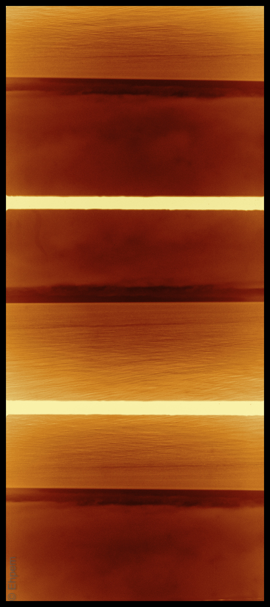
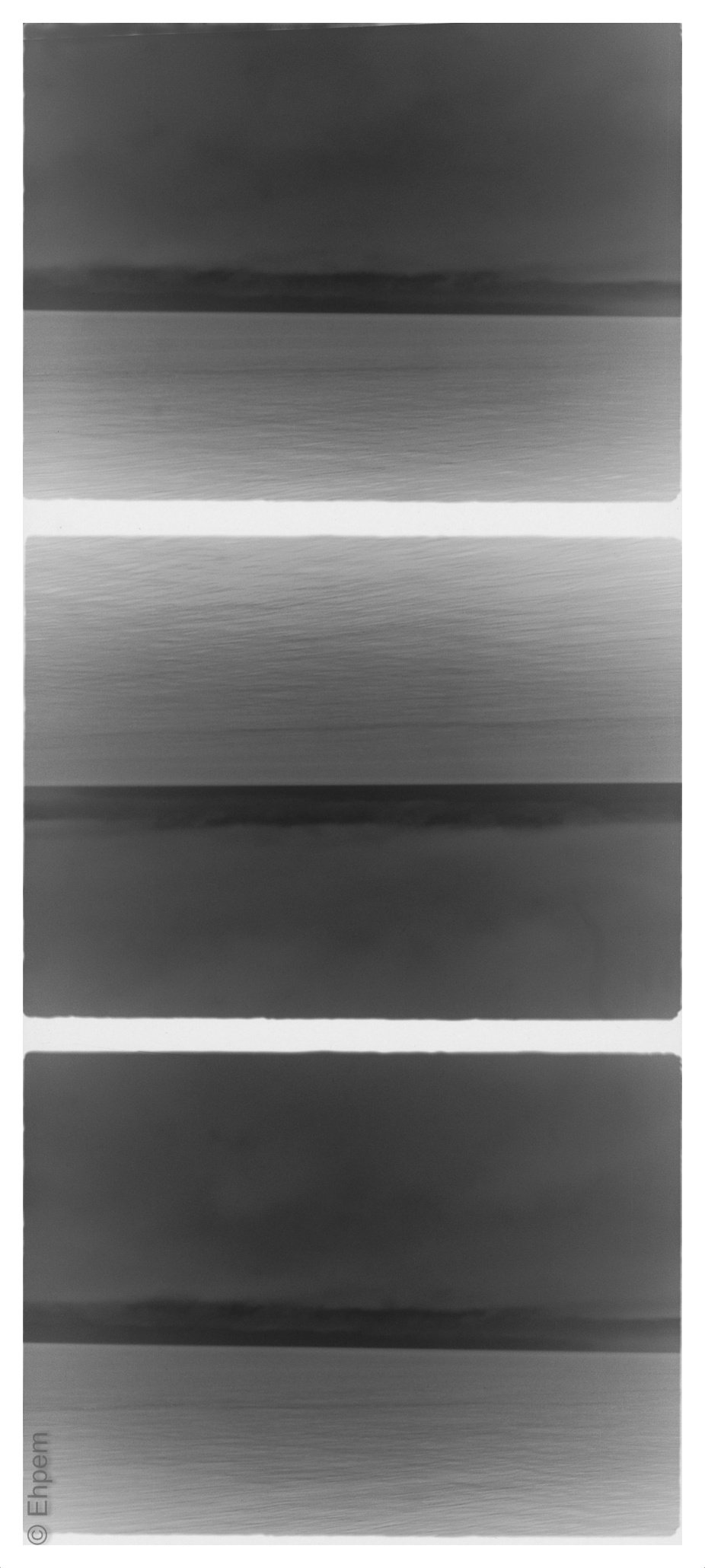
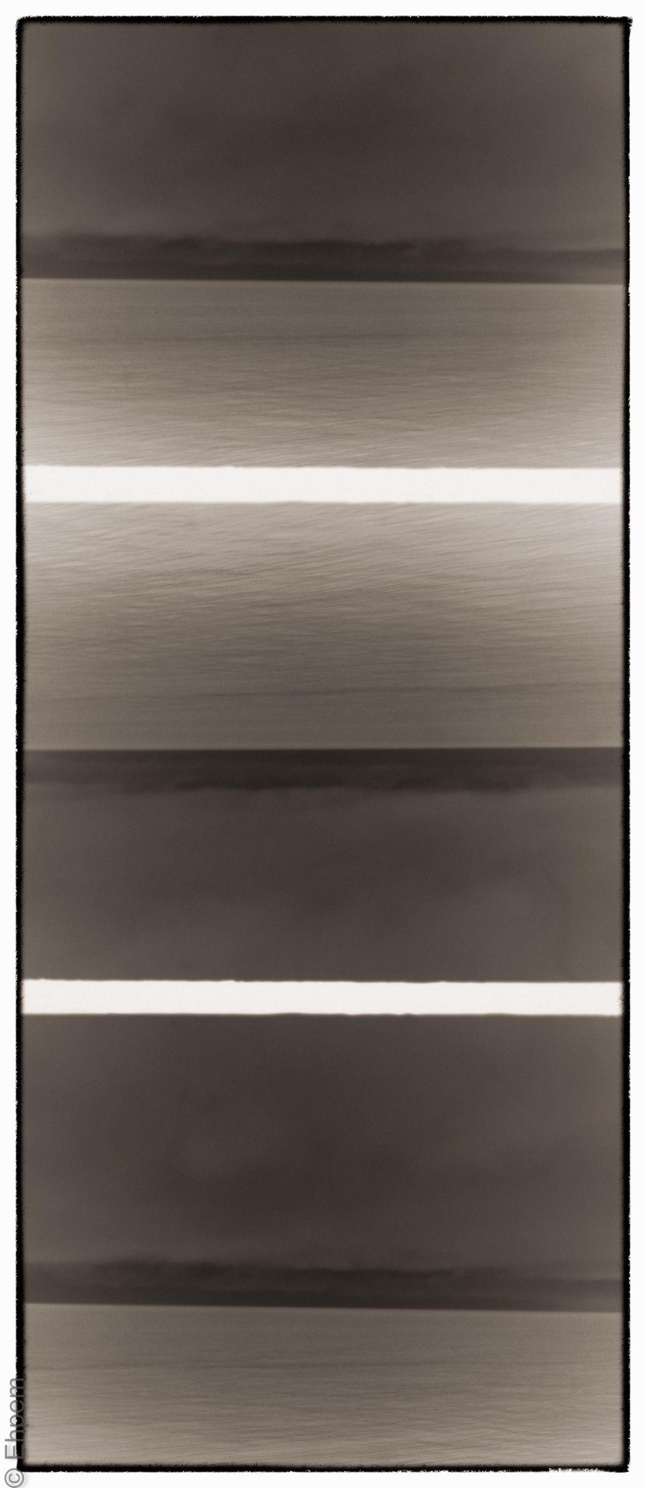
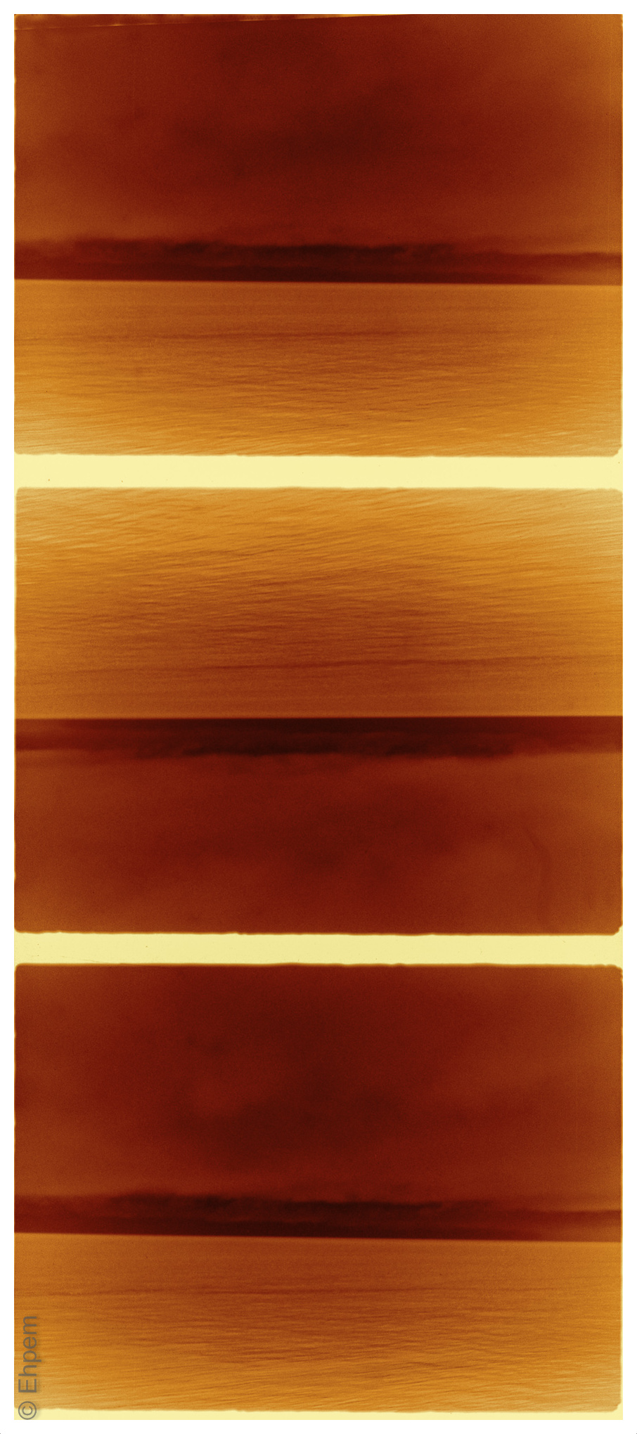
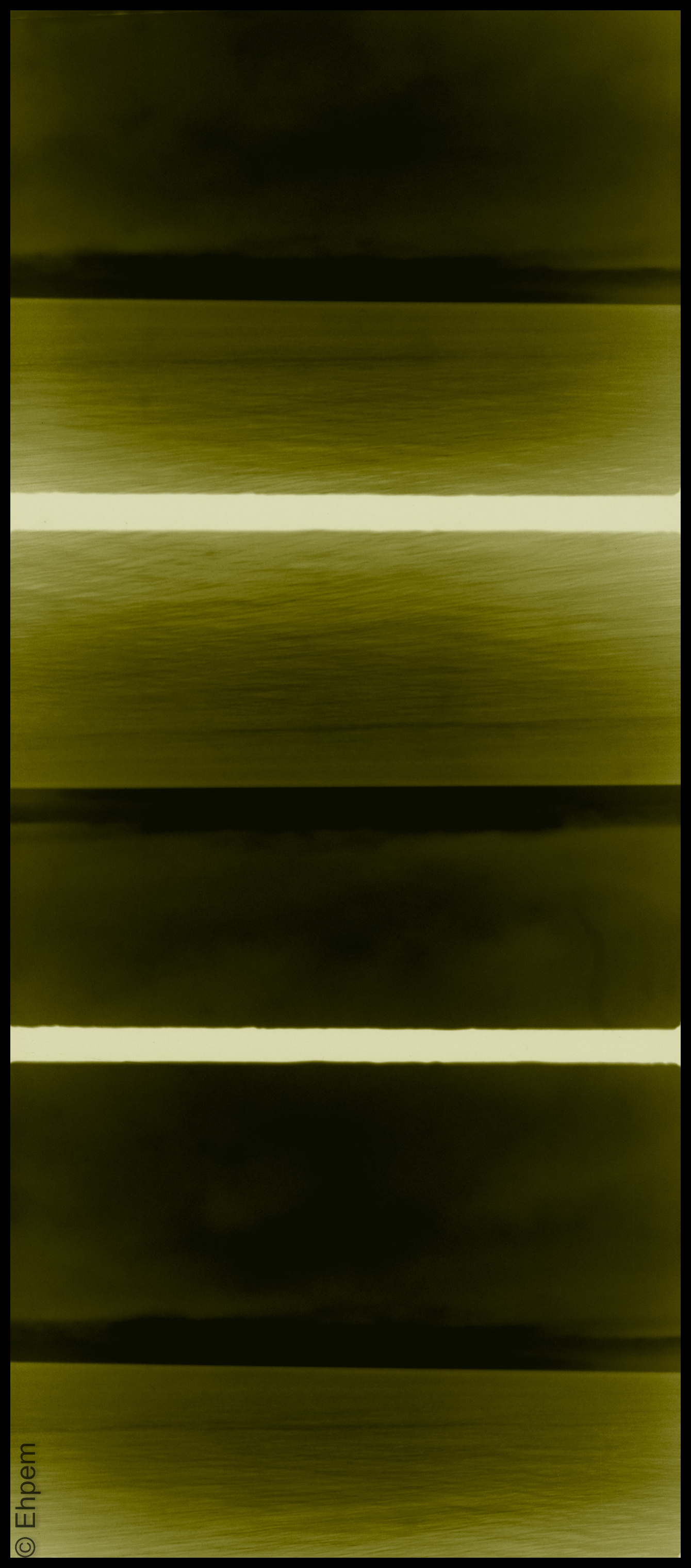
Horizon(tal) in Negative
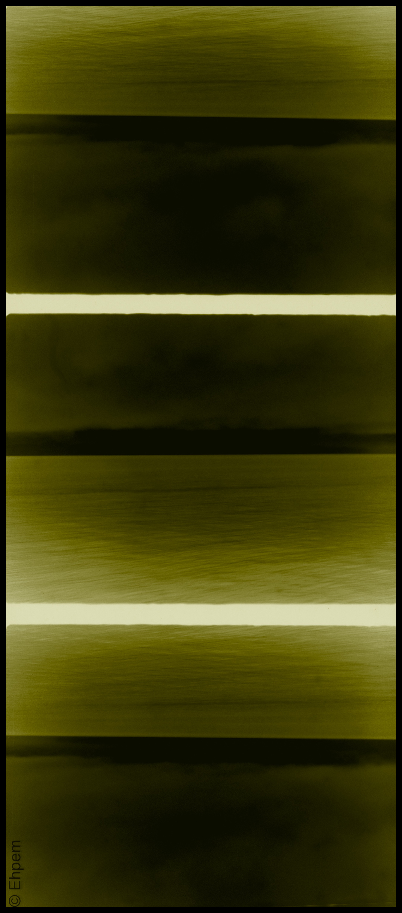
This is a follow up to a post from last week which had the same images in positive, with similar treatments. Today’s is the negative – the scanning mode I was in produced negatives which I had to convert, but I was quite taken by the difference between the negative and positive versions, and so processed both of them.
At the bottom of the post I include a gallery which has the other ones which first appeared in this post, and this one.
Click on any photograph to get a much larger version.
.
.
.
.
.
To view individual photos in the gallery, click on any image, navigate with the arrows and escape to return to this page.


.
Fliptych I have defined here and others can be found here. My horizon(tal) series can be found here. This is also another in the larger category of half-frame photos, and can be included with the other triptychs.
I’m off doing some research in the field for a few days with uncertain access to the internet. If I am slow getting back to any comments you might choose to grace my blog with, it is only because I am not around and I promise I will respond to all of them. So, please comment in my absence, I like comments.
.
Olympus Pen, half-frame camera, Efke KB50, ISO50, 1/50th, ~f5.6.
.
.


Pingback: Negative Horizons | burnt embers
These are gorgeous, Ehpem! I love them all together, too. A visual feast.
The green set is achingly beautiful.
LikeLike
Oh Karen, I am so glad you like the green ones. I don’t get a strong response on that colour of treatment, but it resonates deeply with me, so I am glad to find someone else reacting that way too!
LikeLike
What a gallery! it’s the orange versions that I find so very attractive – such a beautiful palette of colours. This has been a fascinating set of Posts – great imagination and very good execution, Ehpem.
LikeLike
Thank you Andy. I am very pleased with your enthusiasm as these are some of my favourite photos. I expect I will take more, or revisit these scans with other treatments. I too like the orange treatments (adapted from redscale presets in Topaz B&W Effects) best of all. But I think I could (or maybe already do) overuse them so try to intersperse them with others. And I thought the green worked pretty well for the grey moodiness of these photos as well.
LikeLike
really like these – like abstract paintings!
LikeLike
Thank you Emily – that is one of the things I like about them too!
LikeLike