
Red Railings
Our collaboration continues apace with my image above, and Melinda’s below; her co-post can be found here.
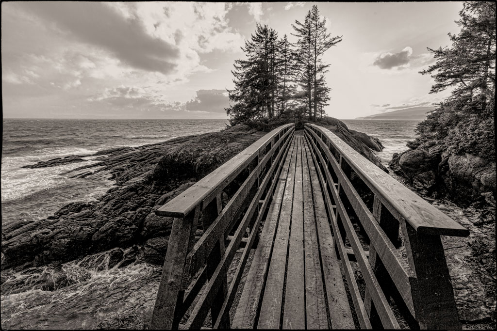
This bridge is built on top of a very large log. I wonder how they got the log across the gap. Perhaps a tsunami dropped it there long ago. What will the resort do when it needs replacing?
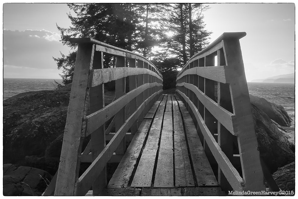
This is a lovely spot and the bridge, which has bright red railings, unexpectedly adds to the beauty. Perversely we both chose to process our photographs in black and white.
Lacking a very wide-angle lens and space to back up for an equivalent look, Melinda chose to emphasis the spider-like pattern of the bridge railings. From her point of view it is creepy to walk into that embrace.
I think these two photos are an excellent example of collaboration. They emphasize quite different aspects of the scene and do so in a way that enhances one another.
.
For other posts in this collaboration click on this link.
My photo – Canon 5Dii, Canon 16-38/2.8 lens @ 16mm
Melinda photo – Nikon D7000, 28/1.8 lens
.
.


Pingback: Red Railings II | burnt embers
Pingback: Forest Path | burnt embers
I find the first photograph, ephem’s, fascinating as a study of leading lines…everything seems to drive the eye to the end of the bridge. The ocean horizon, the clouds, the grain of the rocks on the left side (and the rivulets of water running over them), the trees at the end of the bridge, the slope of the distant shoreline in the upper right, and, of course, the bridge itself. Amazing!
There are strong leading lines in Melinda’s too but perhaps more restricted. Both very well done.
LikeLike
Thank you Mic, and welcome to my blog – nice to have you commenting here.
I think you might add to that comprehensive list the distortion that comes from the wide angle lens. Even though I applied Lightroom’s canned correction to it, I think it too pulls the eye to the centre.
LikeLiked by 1 person
Yes, I think you might be right…one of the subconscious reasons that I have come to prefer wide angle views.
LikeLiked by 1 person
This is a great project demonstrating our different interpretations of the world around us. I agree with the above, both equally beautiful in their own ways. I do have a tendency to like warm toned B&W images through. 🙂
LikeLike
Hi Mark – thanks for commenting. I quite like those warm tones as well! They do crop up with my processing quite a bit.
LikeLike
Two superb images. The first is kind-of classical with the strong lead-in lines to that well-placed clump of trees. The second is very different but equally strong (almost abstract in concept) with those angled spidery arms drawing you into the image. I’m surprised by the data supplied as this looks to be a wider angle view than 28mm – must be down to the good choice of viewpoint.
LikeLike
Thanks, Andy. I very much prefer Ehpem’s shot over mine, as it captures the wildness of the place better than I was able to. And it’s correct that I was shooting a 28mm lens (with a cropped frame sensor, too).
LikeLiked by 1 person
Hi Andy – thanks for the comment. I find this one of the most interesting of our pairs. I think Melinda’s choice of viewpoint is key to her image and in many ways makes it a more interesting shot than mine, even if it has not captured the wildness that Melinda likes. I like the strong lines and graphic aspects of her shot. I think it might do well with a tighter crop of the most graphic parts – perhaps in colour and loosing the lingering bits of wildness.
LikeLike
I think this is the most fascinating of the ‘pairs’ shown so far. Melinda has found the image within the image. As I said earlier I like them both – two very different but equally satisfying images.
LikeLiked by 1 person
Amazing!
LikeLike
Hi Sherley – thanks for dropping by and commenting! I am glad you like this post.
LikeLiked by 1 person
You’re very welcome! Cheers. 🙂
LikeLike
Great picture!
LikeLike
Thanks so much iosatel! It is a great spot, makes a good shot more likely!
LikeLiked by 1 person