
Slab Sunset II

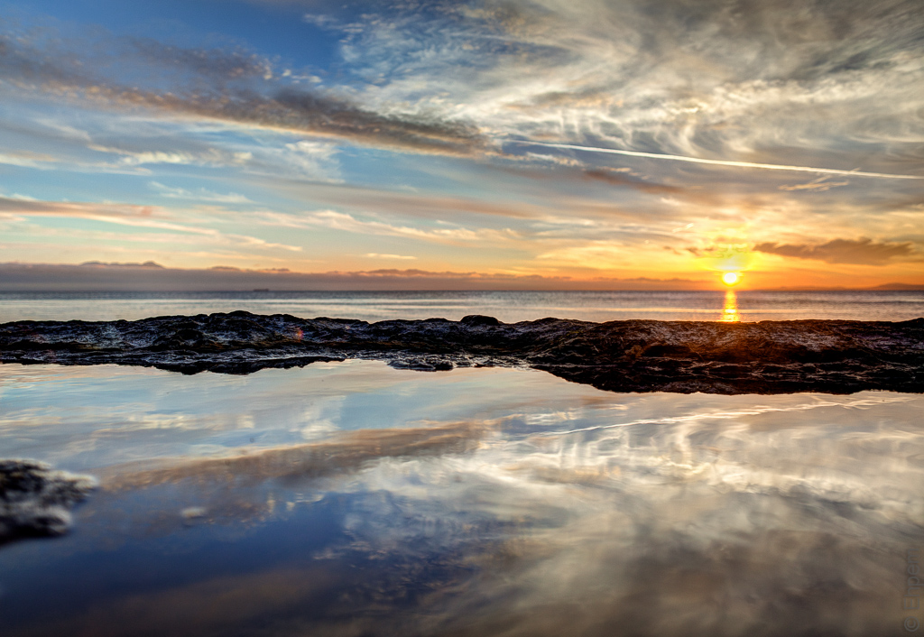
In Slab Sunset a couple of days ago I showed rock slabs reflecting the setting sun at the edge of Harling Point. Today I add a couple more shots, processed in colour and black and white.
Generally I think that the black and white versions show off the reflective qualities of the rock slabs better than the colour, and in that respect I prefer them. (WP has really taken a lot out of the monochrome images, and while I tried to redo them an upload a lighter image, they were even less satisfactory).
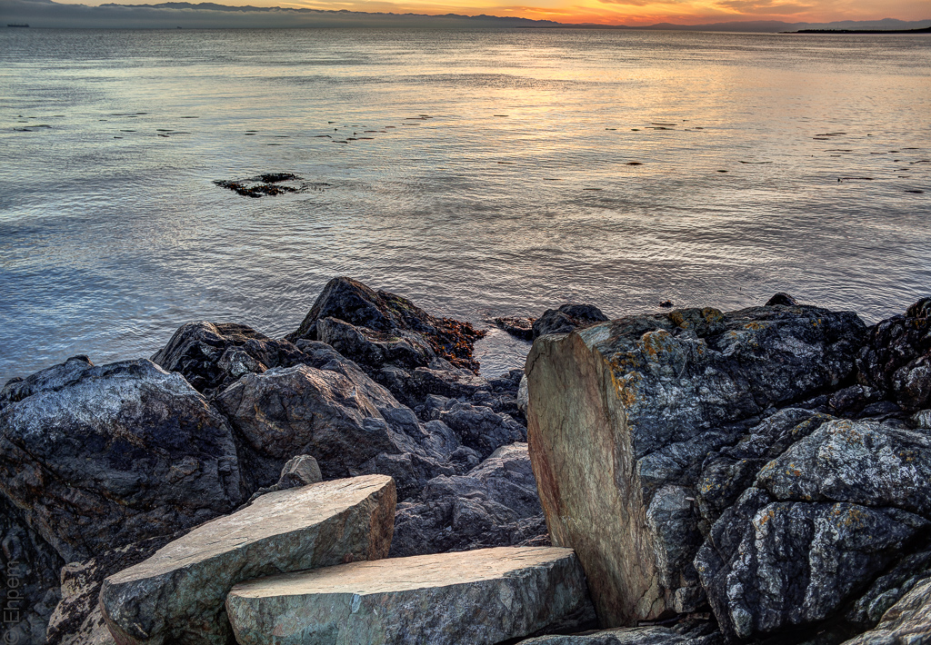
However, because of the degraded quality of the black and white, and because the colour came out pretty well other than the lower emphasis on reflected light, I end up not really being able to choose between these four pictures. If forced, I think I would probably choose the bottom pair.

.

.
![]()
Canon EOS 5D MkII, Nikkor-N Auto 24mm, f2.8 lens at ISO100, f 2.8, top: 1/120th +/- 2.0 E.V., bottom: 1/50th +/- 2.0 E.V.


What wonderful images, Ehpem! I just love the almost abstract feel in certain spots, and the colors in the color shot really shows off the details in the scene just perfectly!
LikeLike
Thanks Toad! I suspect I will have to revisit the processing on these images some time. As per the comments from Ken (Oneowner) below I did get the images out and send them to him. Looking at them again makes me realise they are not all that different from what WP shows. We decided that perhaps it is viewing them right after doing a lot of fine tweaks on the settings might make me more sensitive to the changes and also the editing window in WP is a light background (my LR4 is dark as this blog) so that might also be influencing my eye quite a lot. And then the export to jpeg is making some difference too.
Ken says he finds a bit of change too and usually adjusts his images a bit after he exports them to a jpeg so that they display a bit better. It seems that it is something I need to put more effort into learning about, and probably less into complaining about WP since their crunching seems to be only a small part of the problem, my eye-brain interface perhaps being the biggest.
LikeLike
I bet you thought I was going to like the B&W version better, didn’t you? I did at first, until I noticed the way that little bit of orange lichen on the rock is the same as the orange in the sky…..
LikeLike
Hey Melinda, careful there. Sounds like you might be coming down with something….
LikeLike
The Dreaded Lurgy, perhaps?
LikeLike
I hope not. That one has passed through our place (well, is passing through) and takes weeks to get over. Nasty.
LikeLike
Even the wooden dolls caught it.
LikeLike
I know – it was quite the epidemic up your way!
LikeLike
I like number two
LikeLike
Hi sharkbait – thanks for coming by, and for commenting. I hope to see more of you around here.
LikeLike
Two giant turtles looking out to sea with their broken egg behind them.
LikeLike
Hi yohann – welcome to my blog and thanks for commenting. Nice thought. If there were turtles this size I would really want them to be slow moving.
LikeLike
The subject does lend itself to black and white better than color, in my opinion. On my monitor they look fine with some rich blacks and nice highlights. I wish I could see what you see, though.
LikeLike
Hi Ken. Thanks for the comment. I will send you the images I uploaded. Maybe I am just being hyper-sensitive, or imagining things, so it would be good to get another opinion.
LikeLike