
Johnson and Cook XII
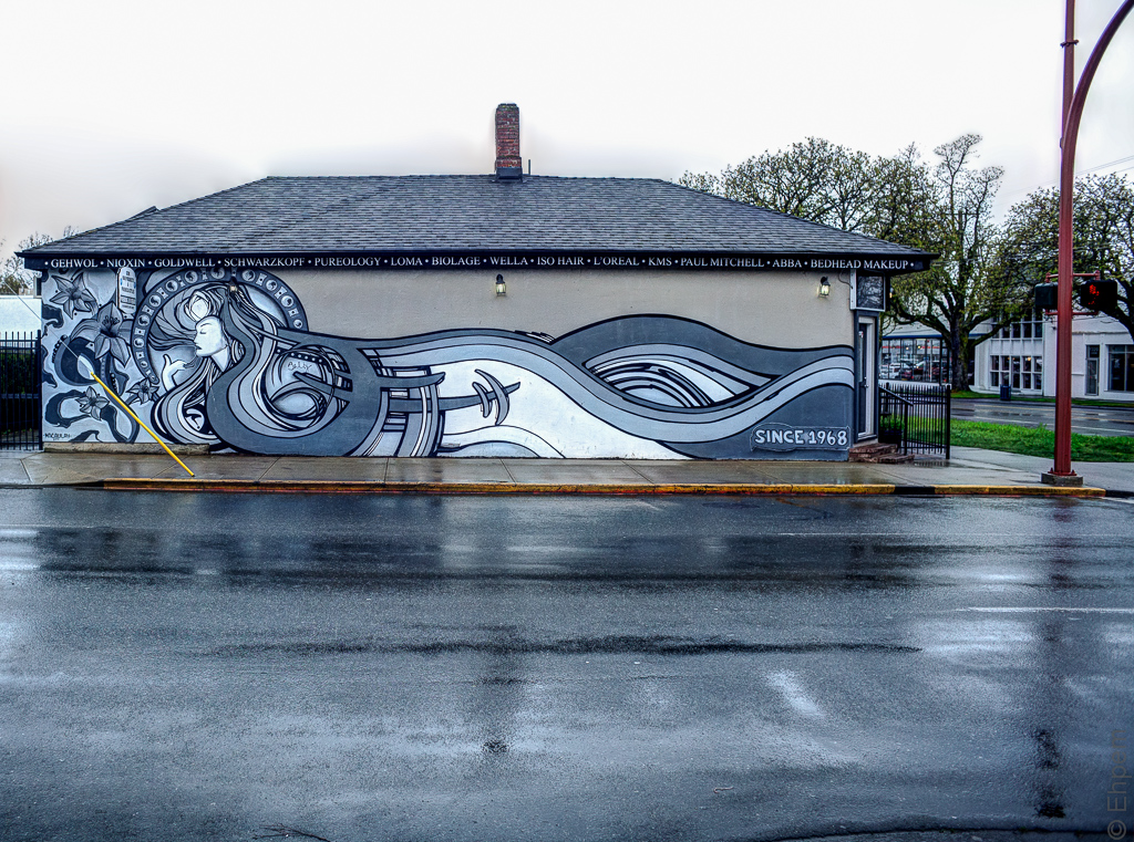 More of my series from the corner of Johnson and Cook Streets here in Victoria, this time a mural that faces onto Johnson.
I don’t know anything of the artist, but appears to be by Morgan Macaulay. I like the colours, they go well with wet pavement. It seems to have solved a tagging problem as well.
My current header is from the front of this building.

.

.

.
I am preparing this in anticipation of the computer parts I have ordered arriving and being installed so as to upgrade that will allow me to continue with timelapse photography, and pretty much all other uses of the computer when it comes to it. Thus, I might be a bit slow replying to any comments until I get the machine back, which might be a couple of days I am told.
.
Canon EOS 5Dii, Nikkor-N 24/f2.8mm lens, ISO640, ~f4, 1/500th, +/- 1.3 E.V.
.
.


I love your processing and the tones in this shot, Ehpem, they really compliment each other just perfectly!
LikeLike
Hi Toad – thanks so much. I find the HDR processing in these circumstances where there is not a high dynamic range to be a quick route to where I want the picture to end up. Even if I use it on a single image, it often works out well.
LikeLike
A glorious mural. Is there a Hair Salon nearby? There has to be a link between the signage, the list of hair products, and the content of the mural, but I can’t quite see where the Swedish pop group Abba fits in. The wet road and sidewalk are a great addition, blending in colour wise. A yellow edge to the pavement together with the yellowish tint to the pavement provides an alternate band of colour, and is a helpful link (I think) with the rather prominent yellow protective covering of a cable holding up a telegraph pole (I assume that’s what it is). But, I did wonder whether it would be worth experimenting with just de-saturating that yellow cable cover?
LikeLike
Hi Andy. Thanks for the critique – much appreciated. I see what you mean about the yellow cable cover. It could be toned down a lot in a couple of the pictures (first and last) to tug more weakly at the eye. Probably not all the way though, but to something more dirty like the curb. I had appreciated the echo of colour in the two locations, I also like it that the yellow is painted imperfectly over older bus stop red.
Gemi Hair is in this very building – entrance around the corner to the right, parking out back to the left.
LikeLike
Nice mural, nice series of photographs! I like how the Gemi Hair Products sign almost blends in with the mural in the top picture.
LikeLike
Thanks Melinda. I too appreciate the relative subtlety of the sign. I wonder if the artist took it into account in the design – I am sure it was there before the mural.
LikeLike
It’s a fantastic mural, a true work of art. The photos look almost duo-tone.
LikeLike
Thanks Ken. It might have been interesting to try a duo-tone treatment on these, though maybe not necessary. I did contemplate black and white which I think would have worked well, but in the end I thought colour worked fine.
LikeLike