
Dock Edge Abstract

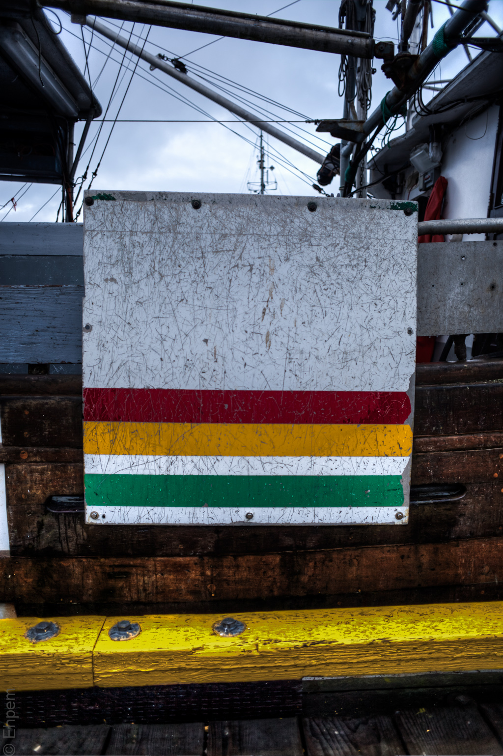
This is a follow-up to Dock Edge that I published earlier today. Ken Bello (Oneowner) suggested a tighter crop for the photo of a painted board which is attached to the side of a fish-boat. He thought it would make an interesting abstract and since he takes wonderfully coloured and textured abstracts (his latest example is just one of many) it seemed worth while pursuing the idea. When this was reinforced by a comment from Andy Hooker at LenScaper, I started this post. Your opinions about which works the best are welcomed.
I decided to just post all the options I came up with. Not having settled solidly on a favourite, I lead with my first interpretation of Ken’s suggestion. In the gallery are the various versions in the order that I did them. I think that overall I probably prefer the tightest crop which has lost the painted curb/rail on the dock. I wish I had a better point of focus – it is down on the curb or bottom of the board. I bit more depth of field would have solved this problem, though the light was pretty low by this time. I could clean up the mask around the edge of the board a bit I suppose, but this is more by way of exploration than perfection, at this stage. I also like the black and white version, though Ken had specifically mentioned how he liked the colour.

.

.
To open the gallery below, click on any thumbnail, navigate with the arrows and escape to return to this page.
-
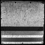
- Black and white conversion of Dock abstract 4
-
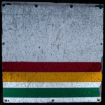
- Cropped to board only, dark border masked in.
-

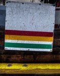
- Tighter crop all around
-
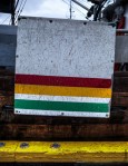
- Same alignment as first posted, cropped, sky darkened

-
- As originally posted in Dock Edge post.

-

- Original image,uncropped, not straightened, various levels changed.
.
Canon 5Dii, Nikkor-N 24mm/f2.8 lens, ISO125, f2.8, 1/100th, +1 EV and -1 EV.


What an interesting study! Great idea, Ehpem, perfectly executed!
LikeLike
Thanks! Credit for the idea must go to Mr. Bello. Fun to try it out though.
LikeLike
The cropped abstracts are nice, but the un-cropped ones make me think of a (stiff) Hudson Bay blanket hanging over the side of the boat. Interesting!
LikeLike
Funny you should say that. While I was taking the picture, I heard one of the people I was with mention Hudson Bay blanket. It had not occurred to me – I was thinking Jamaica. Though the blanket idea works much better, with the white background.
LikeLike
I do like these cropped versions very much. Sometimes composing in the viewfinder doesn’t get the best possible composition, so cropping can save a photo or make it better. Many photographers use only one or two crops (like 1:1,16:9, 2:3 or 4:3) to maintain consistence within a body of work. I’t a common practice because these are off-the-shelf frame and matting sizes, but even then it may not be the best crop for a particular photo. Of course, it’s a personal decision but it’s good to keep an open mind about these things.
LikeLike
Hi Ken. I have thought about the crop ratios a bit, but since I don’t print my images, I have not been too bothered by them – I just do what seems best for the picture, so far anyway.
LikeLike