
Trafalgar Textures
I have been trolling through my archive since I have not had a lot of chances to take photos in the past couple of weeks. One interesting place I landed was in a series of shots that I took for a large panorama that I planned on Trafalgar Park last summer.
It was partly an experiment with a tripod head I had just bought at that time – a video head which is well suited to this task as well. Sadly, my software was not up to the job, so I used a few shots for other things and left the rest sitting. It was also an experiment in HDR panorama, which will have to wait.
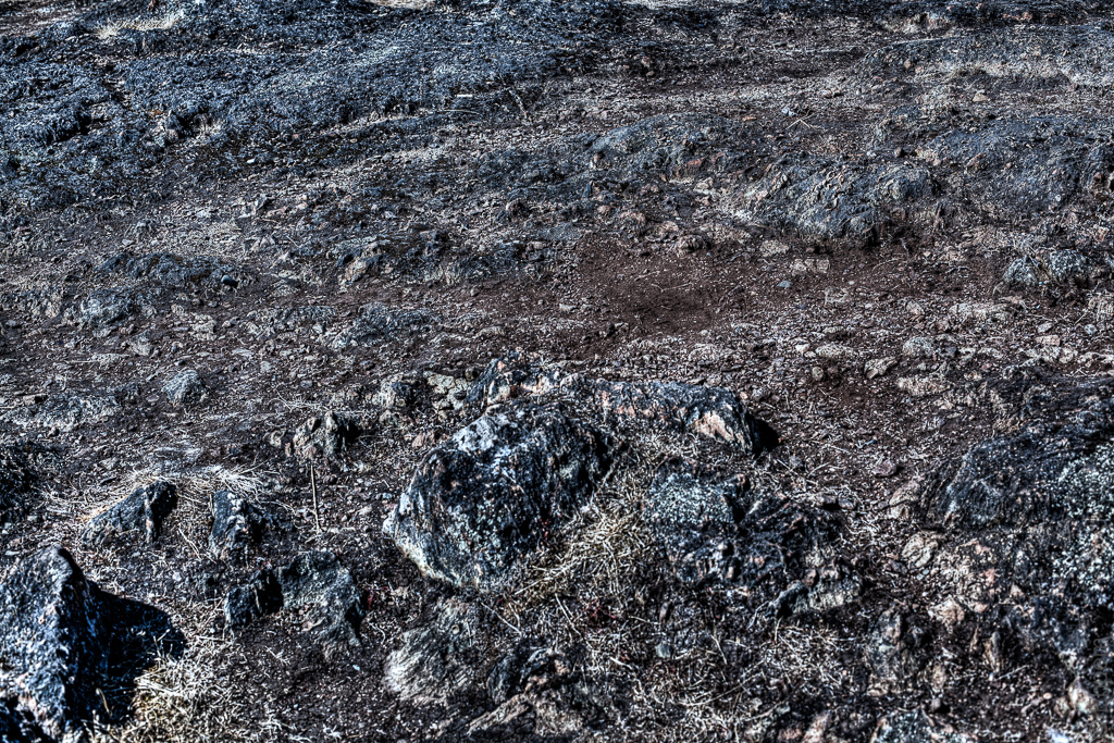
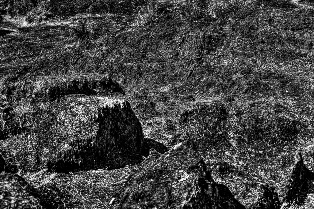
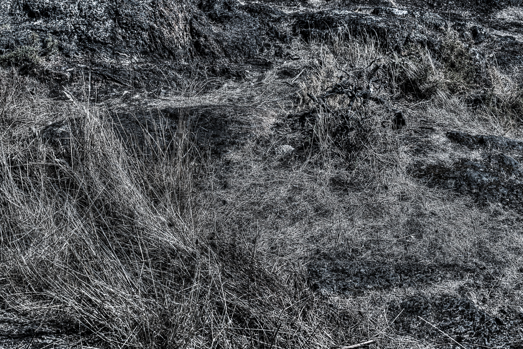
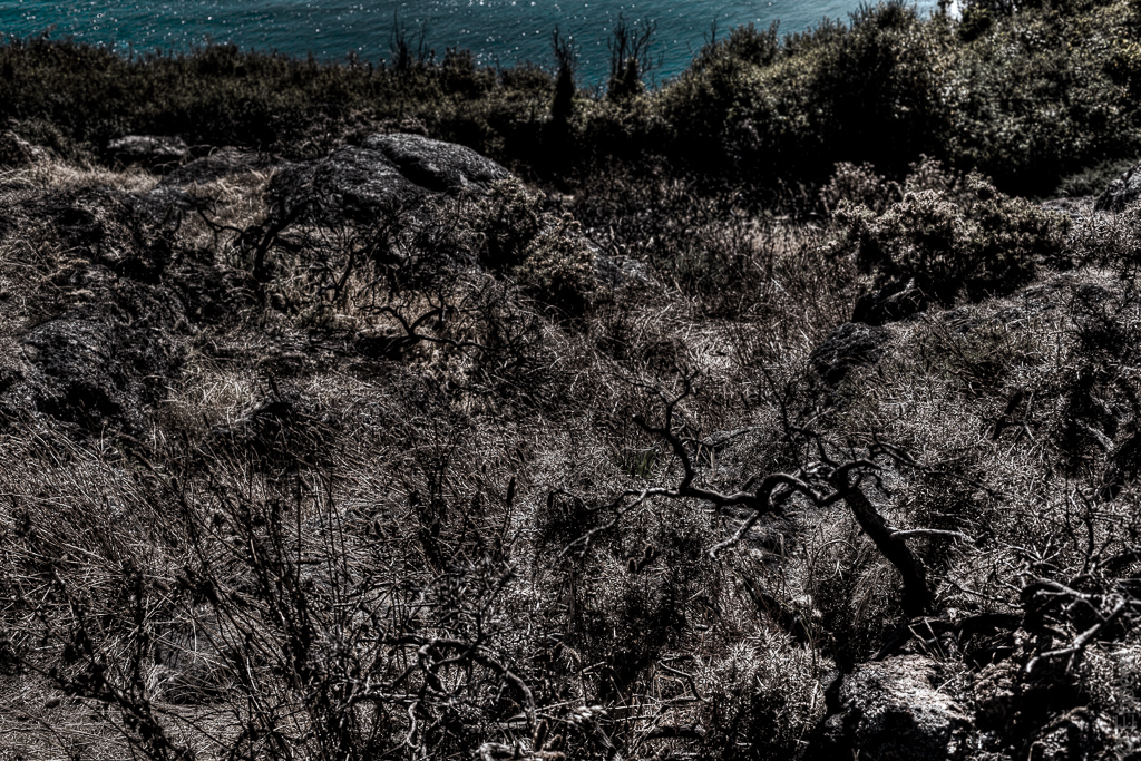
Having a look through all these brackets I was struck by the textures. I have processed a few of the images, using HDR, to emphasize the texture and grittiness of the subject, some to the point of near abstraction. I quite like them, and soon I will show some more slightly less abstract because they have a horizon, and distant ocean. More so than the last one of this group.
.
.
.
.
Canon 5Dii, Canon EF 50/1.4 lens, ISO100, f9.0, 1/329th, each processed from 3 images +/- 0.66 EV


You’re HDR work is really exposing incredible details, Ehpem, yet they are completely natural looking. Really wonderful work, my friend!
LikeLike
Thank you Toad. I am still finding the balance between when HDR works well, and when it is either not necessary or the wrong treatment. Still experimenting all these months later! My next post (Feb 10th) illustrates this…
LikeLike
Pingback: Trafalgar Textures with Horizon « burnt embers
Texture to die for!
LikeLike
Thanks Lynn – some of this would be lovely in a garden too. In fact, my parents have this kind of rock here and there in their garden which they go to some lengths to grow moss over it. Summer pretty much obliterates those efforts, but it returns in wetter weather.
LikeLike
These are very interesting. i love good texture and tonal quality in a photo and this is perfect subject matter and lighting. I also like the monotone and duotone an them, even if it wasn’t intentional. Good stuff.
LikeLike
Thank you Ken. These treatments are in part inspired by some of your work, like your cosmic cement. The toning was not really intentional – on some I desaturated them entirely and on others mostly. I liked the duotone effect, especially in the top shot, though I had to pull the blues down quite a bit to get there.
LikeLike
The photo is better with the toned down blues. It seems more natural.
LikeLike
Mysterious!
LikeLike
Thanks Katherine.
LikeLike