
Trafalgar Textures with Horizon
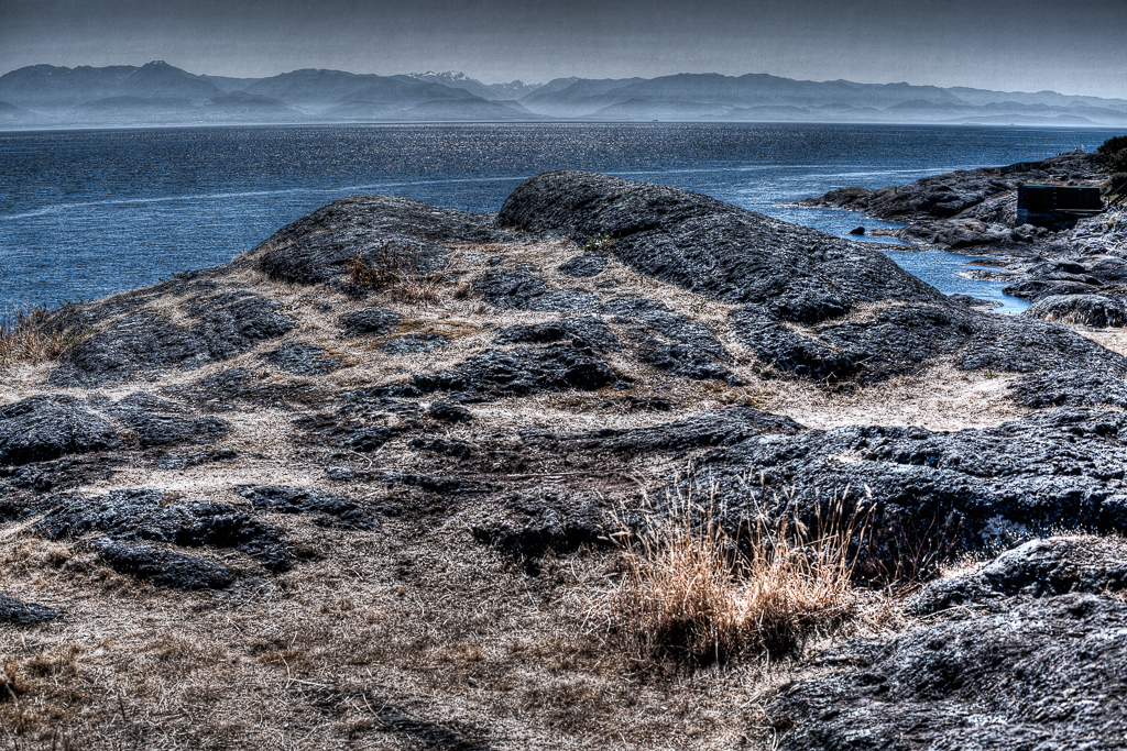
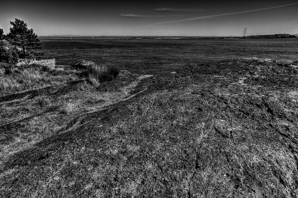
To continue yesterday’s gritty textured rock, but with a bit of perspective.
Some people say I lack perspective. They usually mean I lack their perspective. But yesterday’s shots were short sighted, and today’s seek to address that, while still keeping grit and texture in the foreground.
Distant details of both these photos please me – the Olympic Mountains are at their best in the top photo and the wide-angled leaning radio masts on Trial Island in the lower picture give some kind of energy to the photo. But the rocks and grass are what it is all about.
.
.
Canon 5Dii, Nikkor-N 24/f2.8 lens, ISO100, each processed from 3 images +/- 0.66 EV


The atmosphere in the distance is entrancing (first image). Beautiful.
LikeLike
Thanks Ryan – the view of the Olympic Mountains has been one of my favourite things about Victoria since I was a kid – it very often has interesting cloud formations, or light. Sometimes the mountains a perfectly sharp as well.
LikeLike
Wonderful and something I can understand. I grew up with the Tehachapi and San Gabriel Mountain Ranges nearby. They are stunning, especially when covered with clouds or dusted with snow.
LikeLike
I just love that light that is glinting off the water, it adds a great element to lead the viewer in. Great shots of a very special place, Ehpem!
LikeLike
Thank you Toad – that glinting light is something I have been trying to capture since I first got a 35mm film camera in the early 70’s.
LikeLike
Love the blue-gray and cream of the first one; beautiful!
LikeLike
Thanks Lynn! I like those colours too, especially in the mountains.
LikeLike
I do like that texture with the misty mountains in the background. A lovely contrast. The sparkle in the water makes me think of rain somehow.
LikeLike
Hi Karen – that kind of sparkle on the water is one of my favourite kinds of light – it speaks of summer to me.
LikeLike
I like the added horizons. It gives the photos a bit of scale and it’s more of the traditional landscape/seascape.
LikeLike
Thanks Ken. It is more traditional and I think I like them better for it. Must work harder at the untraditional to see if I can pull it off with aplomb.
LikeLike
The muted colours are lovely. What a range of steely blues. The B&W leaves me cold. It looks flat after the range of depth in the first image. Dare I ask what the man made feature is in the top pic? It looks strangely like an upright piano but I guess it isn’t!
LikeLike
Hi Katherine – I see what you mean about the black and white. I processed these at two ends of the evening – I probably should have revisited the black and white to make it compatible, or posted this separately.
LikeLike
Oh, and that is a quite large boat house in the distance – I don’t think that is what it is used for now, probably has firewood or something in it. It has not yet been converted to a beach house or studio or similar which happens to these old boat sheds. Since they cannot be built any more they are pretty carefully preserved for that kind of use. But this one has no windows. You can get a better idea of it in these shots, which are pretty soft compared to today’s: https://burntembers.com/2012/01/25/fence-stormed/, and these ones: https://burntembers.com/2011/10/17/pebble-beach-harling-point/
LikeLike