
Dockside Reflections

HDR, 3 images +/- 2 E.V.
I had a lot of great comments on yesterday’s post of a new building in the Dockside Green development in Vic West. One of those comments was a fairly extended discussion with my son about the relative merits of HDR and whether it just gives too much information in areas otherwise in shadow, causing visual overload of some kind. That conversation kind of petered out but I think we concluded that for documentation purposes HDR is very useful, but not always suitable for the artistic side of things.
So, following from that conversation, and yesterday’s great comments, I am presenting several different versions of the same photograph, all of them processed to emphasise the light reflected from the buildings, and the reflections of the buildings on the water of the Gorge Waterway. One is HDR in colour (top), one HDR in black and white (below) and the other two colour are Lightroom treatments of the 0.0 E.V. and -2.0 E.V. shots from the brackets used in the HDR. Finally, and as a result of preparing this post, I added a black and white treatment of the -2.0 E.V. frame.

HDR, 3 images +/- 2 E.V.
.
I am of several minds about these versions. I am at heart a documenter – that was what I learned photography for, and spent decades trying to take the best documentation of field work that I could with film. But I do appreciate artistic photography, a lot, and would like to take shots that are artistic as well. Naturally these forces often pull me in different directions. I am probably happiest when the two are combined, though that is less common than I would like.

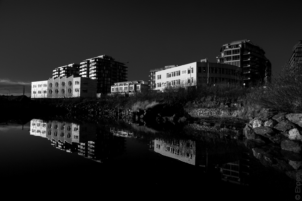
Single shot, 0.0 E.V. Lightroom edits.
.
I prefer the black and white treatment because it really shows the reflected light that I was so drawn to. But, I dislike the halos around the edges of the buildings in the HDR version. I do like the extra information in the darker areas of HDR colour version, but it too has halos and the bushes in foreground to the right are a bit distracting. I could have drawn out a great deal more of the shadows from these brackets, but that did not serve the goal I was aiming at.

Single shot, -2.0 E.V. Lightroom edits.
.
The -2 E.V. version is not too heavily treated as it was closest to conveying my intentions for the light on the buildings (thank goodness for bracketing). The 0.0 E.V. shot below has been quite heavily processed, starting off with lowering the exposure by almost 2 f-stops. I think this version shows too many traces of that heavy treatment, and clearly it just was not the right exposure. Thus, I settle on the -2 E.V. version, and because I like the black and white treatment in the HDR version other than the halos, I decided to convert the single shot after preparing this post, and added it below. If I were doing my frequent thing of posting a colour and black and white version, it would be the last two images only.
If you have opinions about the different treatments I would love to hear them.
.
Canon EOS 5Dii, Nikkor-N Auto 24mm/f2.8 lens, ISO100, f-11, 1/40th +/- 2.0 E.V. (hand-held).
.
.


Wow, I’m going to be the lone voice in the dark, yet once again… first shot. Great details, love the peek into the shadows and how it brings the reflection out of both the building and the sky. Love the colors, too. Your HDR processing is terrific here, Ehpem, the real tell on that is the distinct lack of haloing around the edges of the buildings in the sky. A fabulous HDR image, in my humble opinion.
LikeLike
Thanks so much Toad! I am glad you like that first one (I did lead with it after all) – I like the glimpses into shadows as well. If only I had been able to control the halos in the second shot. It is interesting to get the variety of opinions. I am not surprised you prefer the HDR version but I am a bit surprised that so many others prefer the second colour shot, though there is not a lot to choose between them. Which is a lesson in itself for this style of photography I suppose.
LikeLike
Art is one of those things that’s highly subjective, and I really like your work in this field, my friend. I completely agree with you. 🙂
LikeLike
Yes, I agree – second colour shot is the best
LikeLike
Hi Andy – thank you! You are part of the consensus, which as I said in reply to Toad, I am a bit surprised about.
LikeLike
The consensus is what I am surprised about, not that you are part of it:)
LikeLike
Beautifully lit!
LikeLike
Thank you – the light was fantastic. Low angle bright winter light is a joy.
LikeLike
I like the second the best as well, like Oneowner pointed out: the blues and colors in that one are especially deep. Great one!
LikeLike
Hi rondje – thanks for coming by, and for commenting. Much appreciated! I love those blues too. Sometimes water reflects an equivalent deep blackish green as well, which I also really like. But I will take this blue any time.
LikeLike
The color versions of this have my favorite blue/gold combinations. it’s very dramatic and, oddly, usually translates to interesting black and white. A while back I purchased an HDR plug-in and I was excited at first but I seldom use it. I usually shoot 3 various exposures in contrasty light, such as this, too. So this is an interesting question about which is the best interpretation of the scene. Of the B&W, i prefer the first example, simply because it has a bit more detail and I like detail. Of the color versions, the middle one has the most appeal to me. I’ll pose another question: which version will look the best in print?
LikeLike
Thanks Ken, it is great to have your thoughts on these. I probably need to play more with the HDR conversion to see if I can control those halos better because I like the detail too. Or I could maybe tonemap individual images as that might served the same purpose.
I don’t know the answer to your question about which will print better – I don’t have a printer these days, and have only ever had one of my digital images printed. Maybe someone else has an opinion on this.
LikeLike
I love the very dark, oily tones of the second variant – very striking. And the strong contrast really emphasises the reflections.
LikeLike
Thanks Mike. The reflections were terrific that morning. Perhaps enhanced by the anticipation of an excellent coffee and pastry that would follow the shoot. Which in the end were delivered to me on the dock as I was shooting these pictures – I have a nice family!
LikeLike