
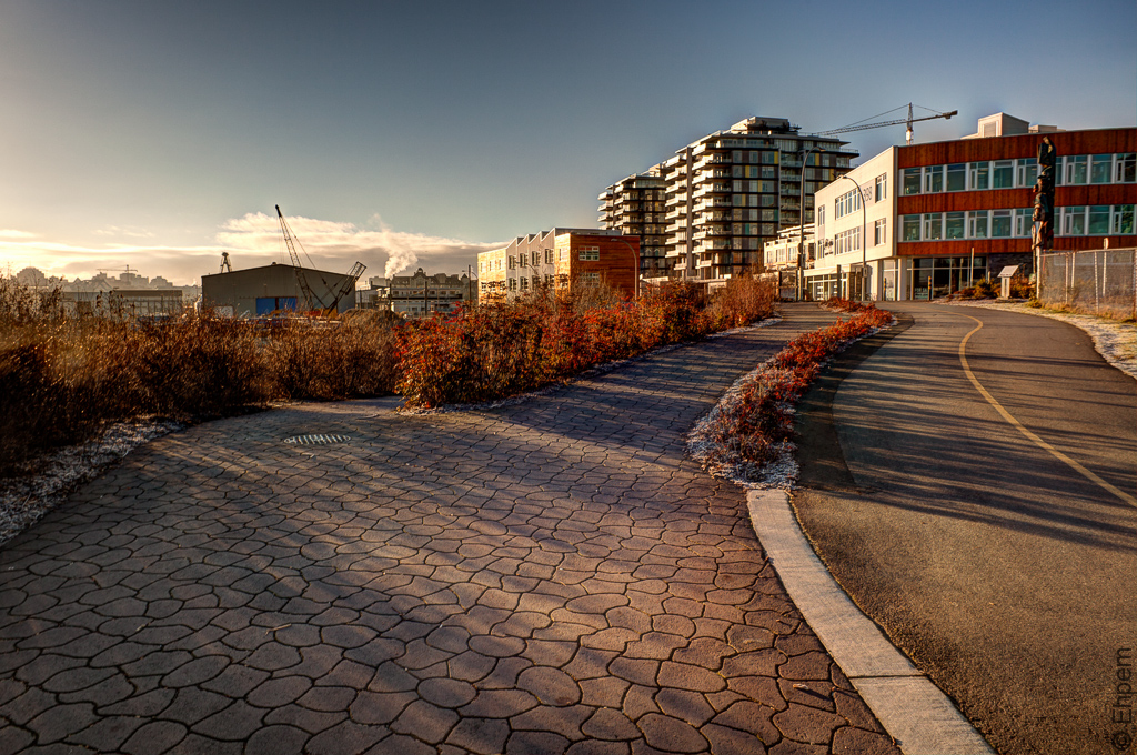
Dockside Pavers

More from the Dockside Green series that started a couple of days ago. This one is clear hands down for the black and white – the detail is better. The halos – well, I guess I will just live with them, in both versions.
.
.
Canon EOS 5Dii, Nikkor-N Auto 24mm/f2.8 lens, ISO100, ~f-11, 1/100th +/- 2.0 E.V.
.
.


Really lovin’ that second shot there, Ehpem! Great colors, great leading lines, lot’s of fabulous details to check out! It’s got it all goin’ on!
LikeLike
Thanks Toad – it is a busy shot, but I think the foreground rescues it from being too noisy.
LikeLike
I’m loving these somewhat urban subjects. Their quite lovely. The B&W image has a really cool lighted effect. Nice.
LikeLike
Hi Ryan – thanks. I really like the shadows on, and textures of, the pavement. I probably should have tried a shot just of the pavement.
LikeLike
Oooh. Texture.
LikeLike
Love the light in this shot!
LikeLike
Thanks Lynn – it really was what caught my attention too.
LikeLike
I like both versions today. The long shadows look ominous in the B&W and in the colour that feeling disappears due to the warmth of the red in the building and bushes. One without the other wouldn’t really grab me but as a pair they are fascinating.
LikeLike
Thanks Katherine. The long shadows and the textures of the pavement was what I was most interested in this view.
LikeLike
One of the things I find interesting in the color version is that the foliage on the shrubs is almost the same color as the building on the right. Coincidence or happy accident? Doesn’t matter, it looks great.
LikeLike
Thanks Ken – at this time of year the stems on those native plants does resemble the colours of that colour of stained cedar. Maybe it was intentional, but I rather think the landscaping was done to be green and local and drought tolerant for the drier summers. The colour of the wood stain is a current fad in architecture. So, happy accident probably. But you are right, they do look good together.
LikeLike