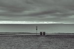
A Pair of Bins

This picture should be subtitled “or a difficult crop”. Crop is not exactly the first thing that springs to mind however. This part of Beacon Hill Park is a popular dog walking area and in Victoria it is required that dog owners pick up after their dogs. The box on the pole has plastic bags for that purpose while the sign instructs. That there is a need for two bins says too much about the volume of picking up. I stood waiting to take this picture for about 10 minutes – there were too many dogs, and their stooping owners, for the simple shot I was wanting.
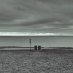
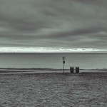
When I was loading the un-cropped version of this picture (first image in the gallery below) the WordPress display showed it square without the bench. The composition seemed better in the thumbnail, so tried some cropping. And I ran into a mountain of indecision. In the end, I liked the version above which is in the original sensor ratio but without the bench and showing lots of the junction between two paths on the left. I kind of miss the bench though.
If I only had one of these images to display, I would not hesitate (too long) about posting it, so it seems a versatile scene.
.
Click on any thumbnail below to open gallery and a larger view, navigate with the arrows and escape to return to this page.
.
.
Canon 5D MkII, Canon 50mm/f1.4 macro lens, ISO200, f6.3, 1/320th +/- 2.0 E.V., processed in Photomatix and Lightroom
.
.


Pingback: Monumental Flip | burnt embers
Here goes, Ehpem: Composition is a very personal thing but there are also so-called ‘rules’ – which we should never follow slavishly and should often ignore. One is the ‘rule of thirds’ which says that the principal ‘object’ in the image should be placed on the intersection of thirds – imagine two vertical and two horizontal lines dividing the image into nine sections. The classic intersection is two thirds of the way across and either one third up or one third down the image. In the headline image the bins are at the critical intersection. So, compositionally that one is the best. There’s another ‘rule’ that states that the horizon should never run straight through the centre of the frame – there should be 30:70 or 40:60 split or something like that. The headline image takes that into account, but the square images have the sea/sky horizon dead centre on the vertical axis which is why I don’t think they work. But then we throw in the bench and life gets a bit more complicated. I agree with others that the bench doesn’t work where it is in the original frame. But…I think it does work if you flip the image horizontally, and then in addition crop the image a little from the left edge to line up the bins on the intersection of thirds (ie one third of the way along from left edge) and then slim down either sky or land to preserve the 2:3 shape. Why does that work? – because of the way the bench is angled. Our eyes tend to scan from left to right and the bench then draws us back leftwards because of that slight angle. Or, some would way, it acts as the full stop to the image and stops our eye drifting right out of the image. Either way to my eye, that works (I’ve tried it, cheekily). Bottom line of course with this idea is whether you are happy with reversing an image. The purists would say No. Sorry, that’s a lengthy critique – hope it’s helpful.
LikeLike
Hi Andy – thank you so much for this detailed comment – what a treat, and indeed very helpful. I am going to try out your suggestions and will post the resulting changes in the next few days. I so appreciate this kind of comment, and coming from someone with your experience they are even more welcome. As to flipping images, that is not something I do, but for no good reason as I seem to do pretty much everything else to them. It could bother a few of my readers who are really familiar with this spot, but I would guess in a photo like this they would not notice. I am certainly going to give it a try. Thanks again.
LikeLike
My pleasure to offer something constructive. I look forward to seeing what you come up with. Flipping an image is one of those points that often doesn’t occur to us. And it’s often not appropriate when the view is well known. But when the ‘view’ is not critical as a document of a place then it’s worth experimenting with.
LikeLike
I like the big one best.
LikeLike
Thanks Ashley!
LikeLike
I think the 2×3 no bench is my favorite, though I can see why some of the others are preferred. The finished product is a personal thing and I would not be one to second guess a photographer’s preference. For instance, I often run across photos by other photographers that I think would be stronger with a different crop but I usually don’t mention it especially if that photographer put a lot of effort into that photo.
LikeLike
Hi Ken – don’t feel shy about pointing out how you might change a photo I have posted – I like that kind of comment and often find them useful, and at the very least stimulating of thought. It is reassuring that I am getting a mixed response to this photo, it matches with my “difficult crop” subtitle.
LikeLike
So far, I guess I am alone in liking the shots without the bench, which (to me) seems like one thing too many. Of the non-bench photos, I like the square crop with the off center bins.
LikeLike
Hi Melinda – you might have been alone for while there, but you just had to wait a while to find a supportive opinion. I thought it was going to go the way of the original framing from how the comments started out, but now the comments confirm my own uncertainty as to what works best. I think youjr “one thing too many” comment is where I had ended up when I lead with my top photo. And it is good you like that off centre square crop – I think it was partly inspired by the way you compose a lot of your shots off centre.
LikeLike
I like things better (this isn’t limited to photographs) when they are off center….
LikeLike
Eccentrics? You like eccentricity? In case you did not know, that is not normal. Not bell-shaped curve of you.
LikeLike
Yes, I am a fan of eccentricity. As long as it’s genuine, not just eccentricity of the sake of eccentricity….
LikeLike
always love beach/sea scenes, always
LikeLike
Hi Belgium – thanks for commenting and welcome to my blog, I hope to see you back again. I am very lucky to live within one or two hundred meters of the ocean.
LikeLike
I also like the original version, to me the bench adds to the image. Thanks for sharing the other versions! 🙂
LikeLike
Hi David – thanks for your thoughts on this as well. Maybe my first instinct was the best one and I was seduced by the idea of cropping. Or more likely but the increased simplicity of the cropped versions.
I see that I also have a like on 1 from another viewer. Which raises a question that maybe someone can answer. There are two different kinds of galleries in WP, one that pops up when I click on the gallery thumbnails and which has arrows on each margin, and another that pops up for some other people, I think which has a picture of the previous and next image as a thumbnail in the lower corners, and clicking on those is a way to navigate. Frequently likes and comments on images in a gallery can only be seen in that mode, by me anyway. And I can only get to that mode by looking at a like notification in WP. For instance, this link takes me to that gallery format, I can find no other way of getting there: https://burntembers.com/2013/12/19/a-pair-of-bins/img_7960_1_2-edit/
LikeLike
I like your cropped pic on the top a lot. After looking through the other options, though, I definitely prefer the one with the bench.
LikeLike
Hi Kiki – thanks for your vote on this one. It is obviously going to be interesting to see how this falls out. The uncropped one is my original idea, the “in the field” vision.
LikeLike