LomoChrome Test – Edits
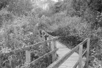
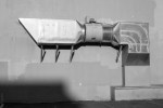
This post has grown out of some comments (thanks Ken and Andy!) made on this week’s series of tests of LomoChrome film. These are different edits of the LomoChrome, changing hue and black and white conversions. No one is going to shoot LomoChrome with the idea of converting to black and white, but I have done it anyway because I like the contrasty nature of the film with vegetation, or with the strong purples. The view of the building HVAC venting with muted purples does not convert to black and white as well as the others do. The hue adjustments are more interesting though, and show some of the more mild things that are possible with this film. What I have not included are any of the more extreme temperature and tint changes, some of which are quite wild with just minor adjustments.
I think there is quite a lot that can be done with these negatives if one is not satisfied with exactly how the colour turned out, though returning them to something more natural is not one of the options.
.
To open the gallery below click/tap on the first image, swipe or use the navigation arrows to navigate and ‘x’ or ‘esc’ to return to this page.
- LomoChrome – temp, tint, hue, saturation, luminance edits
- LomoChrome – as scanned
- LomoChrome – adjusted Green filter conversion
- LomoChrome – split tone
- LomoChrome – purple hue +100
- LomoChrome – purple hue minus 91
- Digital – Green filter conversion
- LomoChrome – Green filter conversion
- Digital – Green filter conversion
- LomoChrome – Green filter conversion
- LomoChrome – hue and other edits
- LomoChrome White Balance Adjusted
- Digital – Green filter conversion
- LomoChrome – Green filter conversion
- LomoChrome Purple – more green in the concrete than the bench paint
- LomoChrome – temp, tint, hue, luminance edits
- LomoChrome Purple – Purple MIA
- LomoChrome – temp, tint, hue, luminance, split tone edits
.
.
Yashica Electro 35GS, 45mm/f1.7 lens, LomoChrome, ISO400, scanned with Epson V700, edited in Lightroom 5 and Canon 5Dii, 50mm/f1.4 lens, RAW, ISO400, edited in Lightroom 5


I think there’s more latitude (both in color rendering and creative) than I initially gave this film credit. There sre some very interesting results here, especially the Paper Box and the grafetti. Nice work.
LikeLike
The is really interesting! Thank you for the comparison, I really have to start shooting film again!
LikeLike
Hi Jamie – thanks for dropping by and commenting, much appreciated. While the number and range of films steadily shrinks, there are some interesting films out there with development of new ones seeming to come every year or two. Or adaptation of something old into something new.
I mix digital and film photography now and find I approach taking pictures on film very differently from on digital. It is actually quite invigorating of my creative juices, and has a good influence back to the digital.
LikeLike