
Rhodo Treated

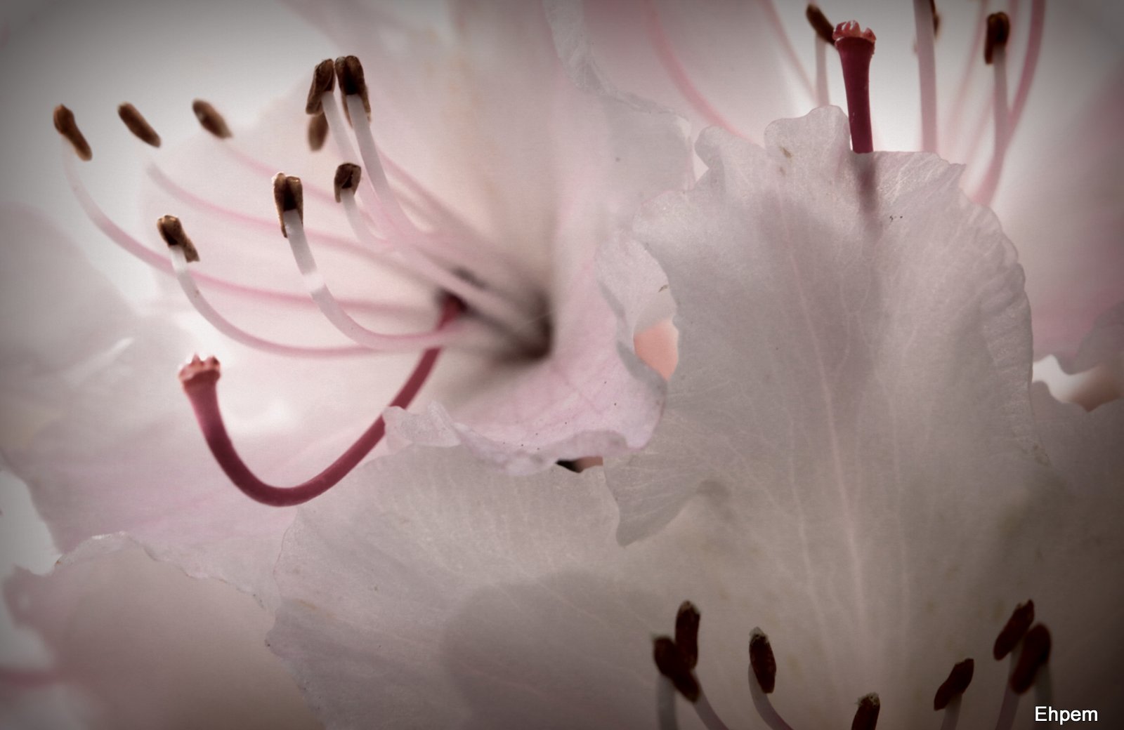
Today’s post features a rhododendron blossom. I was trying to get the most out of this image that I like for the translucency of the petals, the colour and the lighting. I ended up playing with some of the picasa image processing presets, and the ones I show here each, in their own ways, accentuate something that I like in the image.
In the end, I think that for this image, the utility of looking at the other processed versions is to have your eye drawn to something that is present, but more subtle, in the lightly processed version that I lead with above. For instance the HDR-ish version in the gallery below really highlights how transparent the edges of the images are. The photograph above has a light graduated mask of a faint pink colour selected from the lower left corner of the image, and a bit of contrast adjustment, both to bring out the edges of and the veins within the petals .
To view large-sized versions of any of these images click on them to launch gallery viewer, use arrows on sides to navigate between pictures and the escape key to return to this post.
.
-
- Holga-ish treatment, lightened up
-

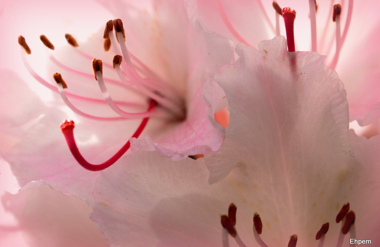
- Vignette using colour selected from image, levels adjusted
-

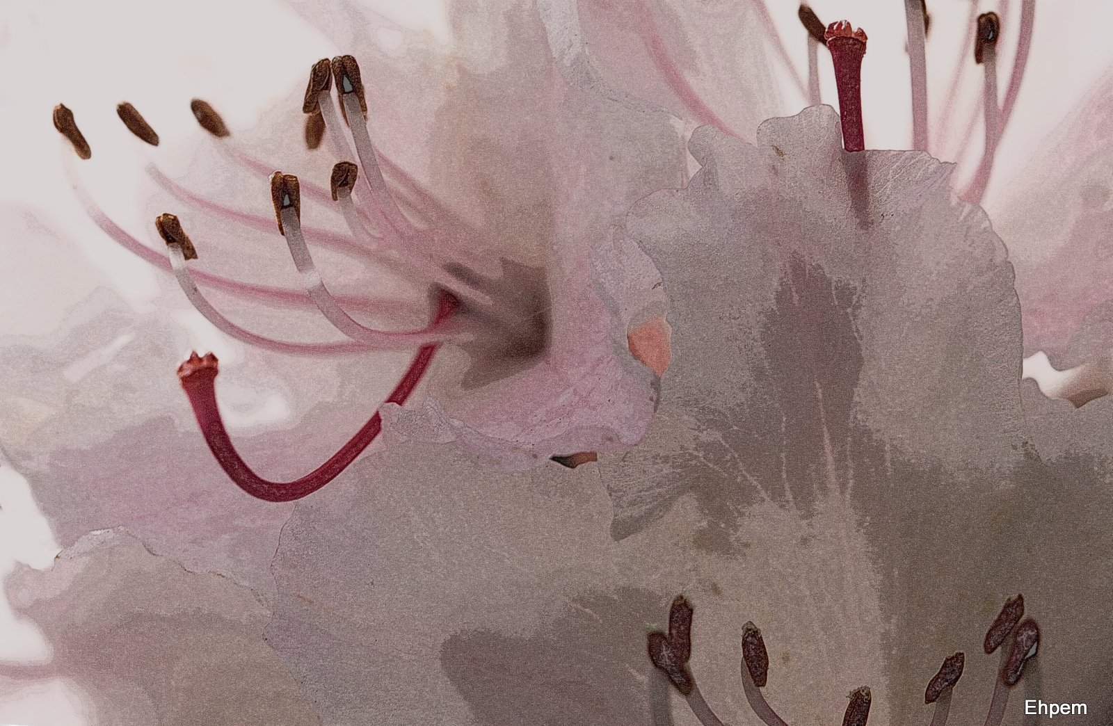
- HDR-ish process, various levels adjusted

-

- Pencil-sketch processing, various levels tweaked
-

- Graduated pink tint
.
For a map of this location see this link (be prepared to wait for a while as the pictures linked to the map take some time to upload. Furthermore, I have just discovered a practical limit in google maps – the list of posts has moved to a second page, so you have to scroll down the list on the left side and choose the second page, then you will be able to see the marker).
Canon 5d Mark II. Images taken variously with Takumar 100/4 Macro. ISO 1000, 1/125th, ~f-8.
.
.


An interesting set of variations. I think I prefer the original but it’s always fun to have a play around – there’s always something new to learn
LikeLike
I totally agree Andy. I find it helps my eye to fool around like this – it can emphasize something that I missed and should have seen, or suggests a better exposure for next time, and so on.
LikeLike
Love this set, my friend, what a unique post with great variations in it for everyone to enjoy!
LikeLike
Hi Toad – thanks so much. I am glad you like it. It is interesting to see what one can do with the picasa filters and the limited controls that they come with. Quite a lot, really.
LikeLike
Fantastic details !
It looks so fragile !
LikeLike
Thank you Mathias. They are amazing flowers up close, I think I prefer them this way to the tree-sized plants that these blossoms can be found on.
LikeLike
Beautiful image – what fun with all of the effects. It’s cool to see them all together in the gallery. I love the original image. You get the play on transparency and light in that alone. The vignette, colors adjusted is lovely as well – it has a nice pink intensity.
LikeLike
Hi Ryan – thanks so much. It was nice to discover the vignette option in the new version of Picasa had an eyedropper for colour selection. I can imagine combining a coloured vignette with a soft focus effect.
LikeLike
My favorite is the Holga filter effect. I like the de-saturated color and slightly soft edges that are very suitable for the subject. Although I’ve done my own share of HDR stuff, they’re always my least favorite of a group, especially flowers. However, it’s a personal preference, you understand, and the look is very popular now. Here, you started with a really nice photo which can stand on it’s own merits without any manipulation, which gives you an edge in applying filters.
LikeLike
I feel that too much interesting detail is lost in the Holga-ish one, but that’s just a personal reaction
LikeLike
Hi Val. I am not sure I agree – on my monitor anyway, moving back and forth between these images I don’t see much that is lost. It could be your monitor though. Have you noticed the gray scale bar below the comments which I added yesterday? If the distinctions are really clear then your monitor is probably pretty well set up; if not, you might look want to see if it can be calibrated.
LikeLike
Hi Ken. I like some of the HDR out there, but it has to be done with a very light hand to please me. The one I produced here, which is not HDR but just some kind of filter to make it look that way, is probably my least favourtite, except that it highlights various details that are interesting to look at in the more subtle versions, once one has seen it.
Have you tried it for documenting objects in the museum? Or is that superfluous because you can control the lighting for what you do?
I also really like the desaturated Holga effect. But my vote lands with the original.
LikeLike
I’ve been fortunate to do most of the Museum work in a controlled lighting studio. Although we only have 3 studio lights, it’s more than enough and the umbrellas give us nice, even, diffused light, so multiple exposure HDR effects aren’t really necessary. Another thing is that we shoot RAW converted to DNG files and edit in Adobe Camera Raw, which gives us non-destructive archival files. From these, TIFF and JPG derivatives are made for cataloging. I’ve tried HDR for some personal work with only modest success. My D80 only brackets in 3 exposure increments. Fine for some subjects and not enough for others, meaning I have to do it manually. I love the idea of HDR but I think, in order to do it right, you need dedicated software, which I don’t have (at this time anyway).
LikeLike
Thanks Ken – I thought that might be the case in terms of photographing objects in a studio. I guess if you are photographing an exhibit or similar, there might be some use for it. My 5dii only does 3 brackets as well. Anyway, I have a lot of other post-processing things to learn before HDR becomes something I want to get involved in. But, sometimes I think perhaps I should be shooting brackets for when that day arrives – some subjects, hard to get to, etc.
LikeLike