
Pride of Place

Cathi Jefferson is one my favourite potters; I eat my breakfast from one of her bowls nearly every day, and use her cups and other pots daily too. One of Cathi’s teapots lives with us – we fill and drain it 4 or 5 times a day (we drink a lot of tea). Somehow we have ended up with a couple dozen of her pots over the past few years. I featured her work more than a year ago in this post.
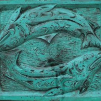
The box in these photos is one of Cathi’s and belongs to friends. It occupies pride of place in their house on this ancient and remarkable piece of furniture.
To photograph the box I had to turn it a bit, it was shiny with reflected light from a window behind the camera. I drew the curtains to reduce reflections as well and thus the exposures ended up being quite long.
The box has shooting stars on it, one of the local wild flowers and so is typical of Cathi’s work which is mostly decorated with local flowers and foliage. If curious about shooting stars, you can see them in this and this post of mine. Cathi’s work is salt glazed with many variations arising from placement in the kiln and proximity to flames and salt when it is introduced to the fire. Some day I will show more of her work that is to be found in our own cupboards – we don’t own any purely decorative pieces, just functional ware that we can use and enjoy in the hand. Sadly, we break a cup every few months. Check out her website to see a full range of her work.

.

.
Canon 5Dii, Canon EF 50mm f1.4 len, ISO 100, f1.4, top – f5.6/6.0 seconds, middle – f8.0/5.0 seconds, bottom – merged from 3 exposures f5.6, 3.2, 8 and 20 seconds.
.
.

Pingback: Cathi Jefferson – Cups | burnt embers
What a lovely piece, perfectly photographed my friend.
LikeLike
Thank you Toad! I think it works very well in this location.
LikeLike
Coincidentally I see that Cathi has launched a Facebook page today! Nice timing. https://www.facebook.com/CathiJeffersonPottery
LikeLike
Both the box and the pottery are beautiful. Exotic even.
LikeLike
Hi Karen – it makes a great combination. The carving is probably English, and several hundred years old, but parts of it, the lower middle panel especially, remind me of African carvings, or rock art from the Americas.
LikeLike
Very nice contrast between the pottery and the carved wood – your photos enhance both of them!
LikeLike
Thank you Melinda – it is a perfect spot for such a nice object – they enhance each other.
LikeLike
Pottery friends (I man, friends with pottery)
here in Vancouver mentioned that she lived in North or West Van until relatively recently.
LikeLike
She lived in North Vancouver until just a few years ago – now she is on the Cowichan River and shows in Victoria area two or three times a year. She teaches at UVic as well.
LikeLike
it’s most difficult to not have any glare on such a reflective piece. A simple turn (in the middle photo) was the perfect thing to do. The color and design are really beautiful. For many years I gave my wife a box on her birthday and we still have all but one.
LikeLike
Thanks Ken. It would have been a shame to lose the design and colour in the reflections. But the glare on the chest does not cause the same problems, in fact it seems to work really well to show the carved patterns. So, a compromise that worked out well.
LikeLike
I like the almost metallic gleam of the old wood
LikeLike
Hi Val. I like that sheen too, it makes that old oak look just as hard as it really is. It also accentuates the pattern.
LikeLike
Remarkable photos, ephem. I like them all and even have 2 Jefferson tea mugs.
LikeLike
Hi Richard – People that like ceramics and live in this part of the world seem to end up her work. We found our first piece in a thrift store about 10 years ago, before she lived on Vancouver Island.
LikeLike