Iris Bug II

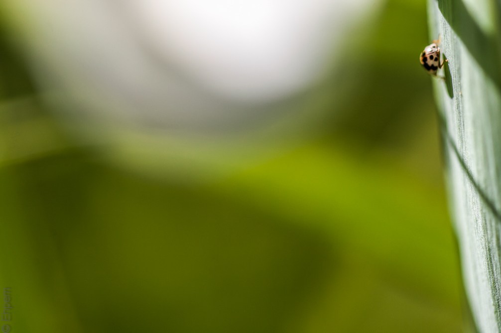
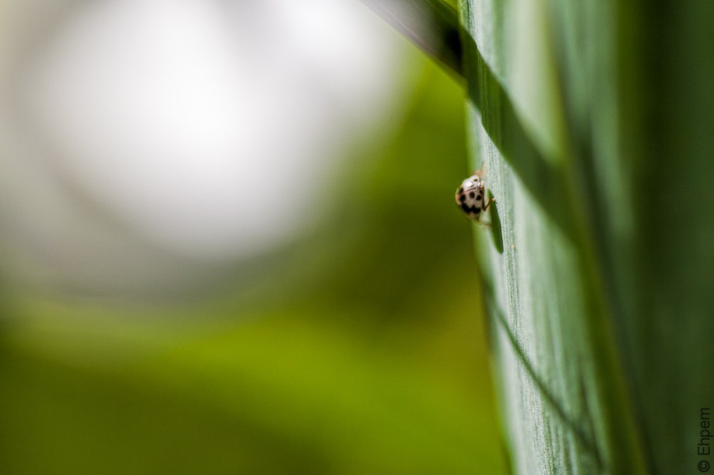
Another in the series from an iris patch in my back garden and also part of the mini-series showing the iris dwellers and users. This is much smaller than a typical lady bug (lady bird) and thus is most likely a carpet beetle. The museum conservator in my life exclaims at what such a pest they are. In fact, at her museum, which regularly rents areas out for receptions and dinners, it is required that the incoming bouquets of flowers be checked for pests, and in particular these little creatures. If seen, then the flowers are not allowed in.
I could not choose which of these crops I like best. When I asked a couple of people in the house, they both said the shot below. I think they liked the background better. However, if I had to choose, (which I don’t so may be it’s a dumb thing to write), I would go for the top one. Today anyway. Does anyone have a strong preference?

.
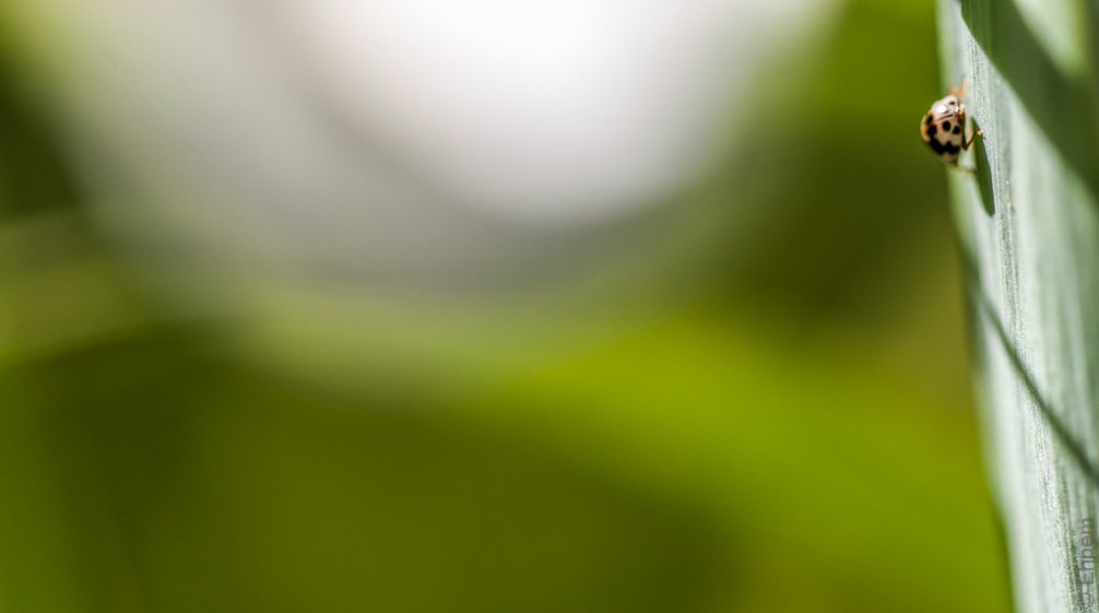
I have added the crop below in response to a suggestion from Ken (Oneowner) in the comments below. Feel free to consider it in you comments below, should you choose.

.
Canon EOS 5D MkII, Canon EF 100mm/f2.8 macro lens, ISO100, f-3.5, 1/400th second, hand-held. Original shot at about 1:1 with a resolution of 5616 x 3744 pixels, first two cropped to 3729 x 2186. Processed with Lightroom 4 and Topaz Clarity.
.
.


How gorgeous!
LikeLike
Thank you James!
LikeLike
I like the top one best. The background shapes work well together and set off the bug. In the second one the strong value contrasts in the shadow are distracting.
LikeLike
Hi skadhu, and thanks. I see what you mean about the shadows, an interesting comment – I could easily tone down those contrasts.
LikeLike
A better sense of scale, I meant to write!
LikeLike
Hi Emily, nice to have you visiting, and commenting! Thanks so much. I am very interested in your ideas about photography, and the Whistlestop project that I first encountered on Karen’s Draw and Shoot blog. Your approach reminds of a visual anthropologist friend.
Anyway, I totally understood what you wrote 🙂 I was going for that feeling of scale, but not wanting to lose the insect completely. Tomorrow’s post is going to be about the same idea. Small insects lend themselves well to this.
LikeLike
Perhaps I should name that project correctly! Journey of a Photograph.
LikeLike
I like the top one – I think it gives the best contrast between the smallness of the bug and the vastness of the world around him, or her!
LikeLike
I’m voting for the very top version, the one right under the words “my surroundings.” The reason I like it best is that the white part of the background seems more subdued, so it doesn’t compete with the lady bug for my attention. Did you burn it in a bit?
LikeLike
Hi Linda – thanks for the comment! That is my header that appears above every post. I made that crop this morning and uploaded it. I too noticed the subdued whites, but I did nothing to make it that way other than crop. I notice that some exports from lightroom are darker, and some imports to wordpress are as well. I looked at the exported pictures just now, and they all have the same tone, so this is a wordpress artifact. Which is interesting because I have thought it was doing that in the past, but found it hard to demonstrate.
LikeLike
Interesting! I’ll have to notice whether the same thing happens with the photos on my blog. I hadn’t been noticing a difference, but now I’ll pay better attention.
LikeLike
I was looking at this again, and it’s a bit hard to make comparisons because I cropped the header from the bottom image. But, some of it is an optical illusion I thing, arising from there being a lot less white. The margins of the white area are a bit grey in all versions. Even so, I think it is a bit less bright.
LikeLike
I’m with Val and Ken – I like the top one better. I think I like the way it doesn’t conform to the rule of thirds, because I like nonconformity. (You already knew that, right?) Very nice greens in these shots.
LikeLike
Thanks Melinda! I love the greens too. The last few days of posts have a green theme to them, quite apart from an iris bug theme. More to come too.
LikeLike
A green bug? Is that next?!?
LikeLike
Well, I do have a green bug shot, but it was not on the irises. I will probably post that one sometime. Most of the bugs are yellow. And dangerous looking.
LikeLike
A greenish header is next. That peony was a mistake in the middle of a green series.
LikeLike
The second adheres to the “Rule of Thirds” (although I think it’s more of a guideline than a rule) so I can see why the household likes it better than the top photo. My own preference is for the top photo but I would crop out a portion of the bottom to just above the watermark for a more panoramic look. It still retains the flowing lines and the bug is still the focal point. Can you tell that i crop ruthlessly?
LikeLike
Thanks Ken! I struggled with the crop – my workflow was I produced the bottom image first a day earlier. When I came back to it, I found it did not really satisfy, so I just moved the crop window around till I found something I liked better. I did not then adjust the proportions, which I should have tried, because I see exactly what you mean and I think it would make a much better use of the green curving line at the bottom.
LikeLike
Ken – I did a version with your crop suggestion and added it to the bottom of the post. Thanks for the idea, I think it is an improvement
LikeLike
I like the top one best. The background colour shapes form a more attractive backdrop
LikeLike
Thanks Val. I think that is what I was liking about it as well. And the vastness of the space scaling the beetle appropriately, while still cropping in close enough to see some detail.
LikeLike