
LomoChrome Test

Left – Digital Image | Right – LomoChrome
This post is the first in a series of tests of the newish negative film LomoChrome. I had not heard of this film until I saw a tweet from a local camera store, Camera Traders saying they had received a supply and were selling it by the roll (otherwise you have to buy it in packets of 5). Below are more examples, one more collage and then individual images in the gallery. Most of the images are specifically chosen to illustrate as many colour shifts in one place as possible. Future posts (see this link) will have more nature shots like the one above and some buildings and painted murals as well.
LomoChrome Purple XR 100-400 (to give its full name) was introduced last year – yes, someone is making new types of film! And like its name suggests, it leans heavily on the purple side of things – converting greens to purple and, with the exception of reds which remain fairly stable, converts other colours all over the place. It was designed to approximate the effects achieved with infrared films, without the need for filters or special processing. I last used infrared film in 1979 or 1980, and that was only a roll or two, so I have no way to assess how approximate this really is though other reviewers seem somewhat disappointed. I think the comparison is probably irrelevant as LomoChrome is its own thing to be learned and made to dance to its own tune. That is if one cares for the look. I think there could be some very specific applications for film like this, but you won’t find me shooting much of it.
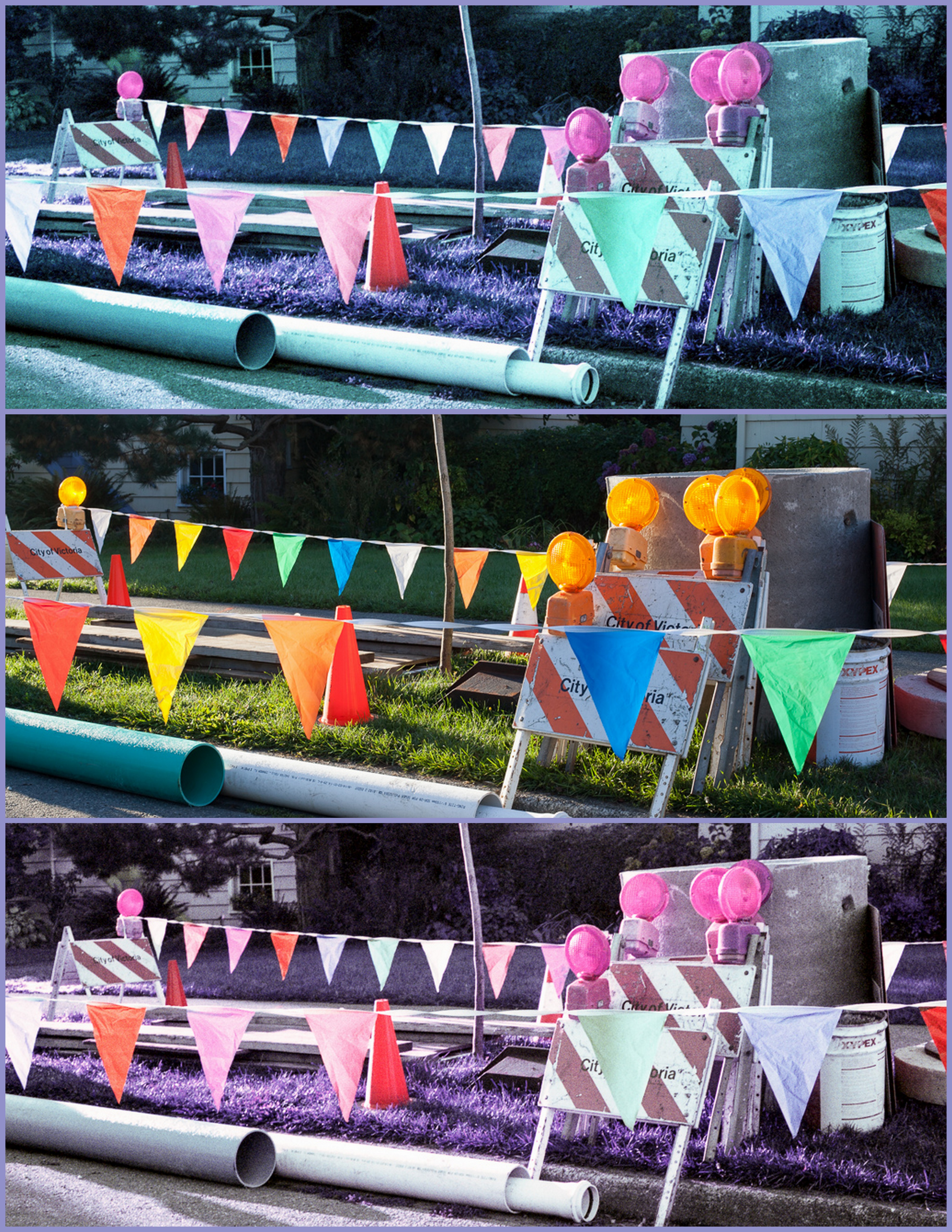
Top – As Scanned. Middle – Digital Image. Bottom – Scan with white balance adjusted
.
I shot a roll of this film in the Yashica Electro 35GS and at the same time took a companion photograph with my Canon 5Dii. The Yashica has a 45mm/f1.7 lens and no filters. Film was scanned with an Epson V700 using Epson Scan in Professional Mode and adjusting the levels for each shot. The Canon has a 50mm/f1.4 lens with UV filter, and images were shot in RAW. I tried to remember to set the aperture on the Canon to match that on the Yashica which is aperture priority only. Both cameras were set to ISO400 (although this film can be shot at any setting between 100 and 400). Therefore, most of the EXIF data in the gallery for the Canon should be very similar to exposures in the Yashica.
Images from both cameras were edited in Lightroom 5, with very minor adjustments to sharpening and clarity, occasionally a small crop, and sometimes a tweak of highlights or shadows. For some of the scanned Lomochrome images I adjusted the white balance in Lightroom as well. This was necessary because the LomoChrome film base is very green and my scanner settings did not always rise above this fact. Where I have made such adjustments to white balance, then I present the original scans and the adjusted version.
To open the gallery below click/tap on the first image, swipe or use the navigation arrows to navigate and ‘x’ or ‘esc’ to return to this page.
-

- LomoChrome
-

- Digital
-

- LomoChrome White Balance Adjusted
-

- Digital
-

- LomoChrome as Scanned
-

- LomoChrome White Balance Adjusted
-

- Digital
-

- LomoChrome as Scanned
-

- LomoChrome White Balance Adjusted
-

- Digital
-

- LomoChrome as Scanned
-

- LomoChrome
-

- Digital
-

- LomoChrome White Balance Adjusted
-

- Digital
-

- LomoChrome as Scanned
.
.
Yashica Electro 35GS, 45mm/f1.7 lens, LomoChrome, ISO400, scanned with Epson V700, edited in Lightroom 5 and Canon 5Dii, 50mm/f1.4 lens, RAW, ISO400, edited in Lightroom 5


Pingback: LomoChrome Test – There Are Greens and Greens | burnt embers
Pingback: LomoChrome Test – Hill and Dale | burnt embers
Pingback: LomoChrome Test – Weed and Water | burnt embers
Pingback: LomoChrome Test – Murals | burnt embers
The film looks quite interesting. It does seem to be a bit of a faux infrared without being red.I would guess on the film emulsion there is some kind of chemical filtration changing the hues of the colours ( this statement is probably not quite correct but I hope you get the idea). I prefer the non white balanced versions as the greens seem to become less saturated.
LikeLike
Hi Ben. I am not sure how the (or any) emulsion works, but I think it must just be a serious exaggeration of the chemistry that gives different kinds of film their signature hues and look.
In Lightroom it would be easy to tone down the white balance to keep some green saturation, or to put some back in other ways.
LikeLiked by 1 person
I think it’s kind of fun. I’d be interested to see what a person looks like in Lomochrome.
LikeLike
Hi littleislander. Because the reds are quite stable the film retains skin tones pretty well. I did not take any up close people shots to demonstrate with but a search of the internet for lomochrome portraits will find many examples – of pale skinned people anyway. I am not sure how it would work for dark skin.
LikeLike
Sort of by fluke, I found this page which has some nice portrait examples of both white and black people. http://www.thephoblographer.com/2013/01/30/what-is-kodak-aerochrome-a-beginners-guide-to-the-confusion-of-lomochrome-purple/#.VDRrvHCOIUU
LikeLike
Those are great shots! Thanks for the link. There are good links in that article too.
I think most or all of the shots on that page are made with Kodak Aerochrome which is one of the infrared films that LomoChrome is designed to emulate – it looks as if the article was written after LomoChrome was announced but before it was widely available, which has only recently happened. If LomoChrome could be made to work as well as Aerochrome, then I would likely use it occasionally.
I saw somewhere a review of LomoChrome shot with coloured filters and it was far less interesting than the Aerochrome results.
LikeLike
Is it in fact infrared sensitive? Could be useful for capturing images of the deer who come at night to take one bite out of each of your apples.
LikeLike
Hi Mario, nice to have you back again.
This film is not infrared sensitive. I don’t know what the chemistry is, but assume that the emulsion is designed to respond to certain colours in certain wrong ways. I guess just an extreme version of the slight hues that are, or were, typical of so many different emulsions.
As to the deer, I can just stand at my window in the daylight and watch the deer 4 or 5 feet from me tasting the apples – easy photography (if I cleaned the window).
LikeLike
I think the film is a novel idea and if I was inclined to shoot film it would be an irresistible challenge. However, I have rarely found color shifts in film to be an improvement over correctly balanced and controlled shots. I experimented with filters and inappropriate light sources (for the film) and had very few successes. But given the right subject matter and color, you might be able to make some very interesting images. Of these shots, the loading platform with the railings is my favorite. It’s the type of shot where the color can shift in any direction and still be interesting.
LikeLike
Thanks Ken. I agree, the colour shifts have a “fun” factor, but in the end they usually don’t make a shot better, or make a shot at all. But the fun part is worth engaging in, a bit. Film tests seem to most often be quick snapshots taken to make the way through a roll of film, so most of the pictures are not all that interesting in lomochrome nor would they have been rendered any other way. I had that in mind, but like those other photographers, was wanting to get the film through the camera to see how it worked out. I revisited some of my recent haunts with film cameras, and tried to find things with lots of colours in them for comparative purposes. Which means there is some graffiti coming up (really no point in shifting those riots of colours) as well as shots from a nice walk that I took with my partner which concentrates a lot of greens/purples in one place.
LikeLike