Horizon(tal) XII
The rain and dark of winter have returned after nearly two weeks of clear cold weather.
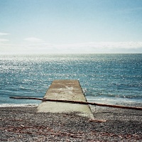
My frozen fingers are regaining some control over the processing sliders, but not soon enough for this shot.
Am I the first photographer to blame over-processing on the weather?
More in this series can be found here.
.
See the comments below for discussion on this second image which was added after edits suggested by my readers.
.
.
Canon EOS 5D MkII, Canon 50mm/f1.4 lens, ISO100, f3.2, 1/200th +/- 1.0 E.V. Processed in Lightroom 4, Photomatix, Topaz Restyle.
.







this is such an amazing shot! in awe!
LikeLike
Hi Himani and welcome to Burnt Embers! Thanks for your comment.
LikeLike
Another exceptional image! Isn’t it funny how the images we feel so often unsure of, are often the ones that have greatest appeal.
As it happens, I was working on some pictures last night and finished one that’s very similar in subject matter, but different in feel. (I’ve posted on my web site it as a kind of visual reply.)
LikeLike
Thank you Gary. There does seem to be a trend like that. I am sometimes surprised by a picture that really captures my viewers, having hesitated to even post them.
I really like that shot of yours, it is a very nice depiction of that view. The light on the sea is common, but much less so to have the clouds down to the water but not making it hazy. Anyone that wants to see it, this is is the link: http://filmadvance.com/2014/02/staring-at-the-sea/
LikeLike
I don’t know about you, but part of my reluctance for shots like these is that they’re often a minefield of cliches. I’m never 100% confident I’ve avoided all (or, even most) of them. Still, if you worry too much about that, you might never take a shot ever.
LikeLike
I sometimes think about that too. But I find it hard to separate out the cliches. By some definitions, every sunset/sunrise shot is a cliche, every pet, every Mt. Fuji with lenticular cloud and every grizzled bum on the street. So, I just try to ignore that and just take a good shot. After all, they are cliches for a reason – something interesting that caught that first photographer’s eye that has since, often unknowingly, caught the eye of many others. Nothing wrong with that I don’t think. I am, though, sometimes a bit put off when I take a shot I really like only to find it has been done before (lots) and I was not aware. My blog is full of shots like that which I have come to realise are a bit tired only as I see more and more photos over the past couple of years that I have got serious about this. I have not yet got to the point of caring enough to take down any posts.
LikeLike
Great conversation going on here. Whatever you did, ehpem, the second photo is a vast improvement over the first one (including the different cropping) and I like it a lot.
LikeLike
Thanks Joseph. I think the improvement I like the best is the additional blue in the water – it makes the lower 1/3 seem more like part of the picture. I really appreciate this community for frequent suggestions about ways for me to improve my photography. It is one of the main things that motivates me to go on blogging, and every day.
LikeLike
So, I have tried out Ben’s and Ken’s suggestions in the comments and with less success than I would have liked, but some. I only went as far as I could in Lightroom. I have added another version of the shot, and while I was at it changed the crop too. Most of my effort went into masking the ocean area and using the few tools that LR provides for adjusting with a brush – I found the best combination was to pull the clarity all the way down and to up the noise nearly all the way. The former muted some of the banding and the latter emphasized the horizontal though small waves in that area, which also obscures the vertical bands. I changed the white balance a bit too – cooling it down a bit to bring out a few of the blues.
I tried adjusting, for the whole image, individual colour channels, but with little desired effect. However, I ended up tweaking them to make the sky look a bit better. I will add the adjusted image to the post in a minute. Thanks for the suggestions – it made it a bit better, but not quite where I would like it. If I had more time, I would reprocess the image, or one of the brackets to see if I can get something similar without the banding, and maybe a bit more colour in the foreground
LikeLike
I don’t think it’s overprocessed at all. but if you wanted to lose some definition in the foreground you could use the adjustment brush over it with the clarity slider set to zero. It gives a slight blur effect and gives the appearance of eliminating noise (and detail).
LikeLike
Thanks Ken – that might do the trick for the vertical banding, and the image would not lose any important detail, which is all in the sky.
LikeLike
Nothing wrong with that at all, Ehpem. Just striking and powerful.
LikeLike
Hi Andy – thanks for your comment. It was a great sky, but kind of grey and muted and in need of a heavier hand in post processing than usual.
LikeLike
Heavy hands make light work. terrible pun but you will know what I mean
LikeLike
Ha! I think there is a blog name in there somewhere. Perhaps for posting the more extreme forms of iPhoneography (like Rubicorno’s excellent work with phone apps, and light).
LikeLike
I don’t think it’s overprocessed – and Iike the ambiguity of the foreground, which could be the sea, could be dirt, could be shot from a very high vantage point or from a very low one.
LikeLike
Thanks Melinda. That ambiguity partly arises from the lack of colour in the foreground. I am not sure where that went! Dropped out along the way.
LikeLike
Maybe it will show back up in another shot – be watching for one that has, unexpectedly, a lot of color. At that point, the universe will be in balance.
LikeLike
Come to think of it Melinda, I did the initial processing of this shot around the time colour was showing up, unusually, on your blog. I think it must have been a balancing act in action, and I just didn’t make the connection till now.
LikeLike
So THAT’S where the color came from. I’d wondered… There’s one more color shot queued up (it’ll post on Friday) but things settled back down after that. Thanks for solving this mystery.
LikeLike
Stunning!
LikeLike
Thank you Iosatel!
LikeLike
Very nice moody photo. The only area that would make think that it is over processed is the very dark foreground. A little flecks of detail would take away any feeling of being over processed. IMHO
LikeLike
Hi Ben – thanks for the suggestion. There actually was very little detail in the foreground – it was a very smooth day. There were a few residual white flecks that were not really the kind of detail you were suggesting which I cloned out, but perhaps they would have inserted some interest to the foreground. As I said to Val, it is the vertical banding which I can see and which is a processing artifact of some kind.
LikeLike
I really think I need to retract my comment. I originally wrote it after viewing the post on my tablet. Now on my PC the foreground looks fine. I can see the banding artifacts in the sky. I am not sure how you can get rid of it. I have read that you can minimise it by adding noise to the colour channels but I have never experimented with this technique. Maybe use a localised curves adjustment to reduce the contrast in that area as this would reduce the banding but also alter the contrast.
In the end it is a nice shot, moody and atmospheric.
LikeLike
Hi Ben. Interesting to hear about those techniques, I will have to keep those in mind. I think this is a Topaz Restyle artifact and playing with their levels a bit more might deal with it too – I did not notice the banding at the time of processing. But, perhaps it is a combination of many things including processing an hdr image first, and probably unnecessarily, and then not liking it enough so continuing on with other software instead of backing up and starting over again.
Also, you raise a good point about the device an image is viewed on. Until a month ago I only had a desktop computer for viewing. Now that I have a cell phone, I can see that many images don’t come out too well. It would be interesting to know how many of my views are through tablets and phones or laptops with crappy displays because in theory it could impact how images are processed for this audience (kind of like thinking of what kind of printing an image was going to be distributed through in the old days – column width in a newspaper vs full page high quality magazine vs photographic print, etc. I am not going to bother changing what I do, except to make it look better on my monitor, but it might explain why some kinds and styles of image that I present get a much more positive response than others – perhaps they just look a lot better on a small display. And, I should probably keep the device issue alive in the back of my mind when choosing what to post on the blog.
LikeLike
Why do you say its “over-processed”? I cant believe you aren’ t delighted with the way it came out. I think its a terrific photo.
LikeLike
Thanks Val. Perhaps last minute doubts on posting. The foreground is what bothers me, it has vertical banding that is a result of processing I think.
LikeLike