
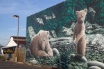
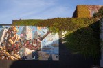
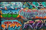
LomoChrome Test – Murals

Top – Digital. Bottom – LomoChrome.
This post is the second in a series of tests of LomoChrome film. See the first post for more details on my methods in this test. Today’s post concentrates on wall murals, or graffiti, depending on your point of view.
I think it is pretty obvious that these are not an appropriate subject for LomoChrome. The wall art loses too much vibrancy, its character is totally missing. I chose it for having a variety of colours and thus as a good subject for these tests. While it has some utility for a narrow application like that, I can’t see shooting any more wall art with this film. However, the ivy in the top pictures came out well and that is probably partly thanks to quite strong evening light, just at sunset. All but the first and fourth tests in the gallery were taken under these lighting conditions. The other two were taken in more overcast conditions with flat light.

Top – Digital. Bottom – LomoChrome.
.
To open the gallery below click/tap on the first image, swipe or use the navigation arrows to navigate and ‘x’ or ‘esc’ to return to this page.
-

- LomoChrome – as scanned
-

- Digital
-

- LomoChrome
-

- Digital
-

- LomoChrome
-
- Digital
-

- LomoChrome – as scanned
-

- Digital
-

- LomoChrome
-
- Digital
-

- LomoChrome
-
- Digital
-

- Digital Top, Lomochrome Bottom
-

- Digital Top, Lomochrome Bottom
.
.
Yashica Electro 35GS, 45mm/f1.7 lens, LomoChrome, ISO400, scanned with Epson V700, edited in Lightroom 5 and Canon 5Dii, 50mm/f1.4 lens, RAW, ISO400, edited in Lightroom 5


Pingback: LomoChrome Test – Edits | burnt embers
What strikes me most about this film is the very reduced palette of colours, with the consequential loss of brightness and contrast. I think Ken is in the right lines in suggesting adjustments to Hue. I think some radical work with the sliders would produce some rather surreal results which would have considerable ‘punch’.
LikeLike
Hi Andy. I have been playing with the hue and other sliders. Some of these images (the ones of natural greens) are only left with two hues – but the digital versions don’t have a lot of variety either. The other thing I found, and found a bit surprising probably because my eye is not used to looking, is that on black and white conversion this film is much more contrasty than the digital images. I much prefer (most of) the black and white conversions from the film than the digital. I will post some of the images that I have fooled about with tomorrow, since it seems to be an important aspect of testing that both you and Ken have raised.
LikeLike
Pingback: LomoChrome Test – There Are Greens and Greens | burnt embers
I don’t know if you can see which photos in your carousel I liked vs. the ones that I “didn’t.” I didn’t mean that I didn’t like them, but I voted which I liked better. I think lomochrome may have won out overall, so there you go. I don’t think the subject was bad at all for a test. Thanks for sharing your experimentation with us. It’s bold. I like it.
LikeLike
Hi GGNB. Likes in the carousel and gallery modes are pretty hard to see. I can see them if I can find my way into the carousel, but I can only do that through the WP dashboard for some reason, not sure how external viewers get into that mode.
I did look at your choices though and 4 out of 6 likes are for LomoChrome shots, so that is a clear win for the film.
I don’t think the subject is a poor one for a test, but personally I very much prefer most of the “natural” images of this art. I am not a huge fan of the distressed look of various post-apps, though some of them when done well are very compelling. LomoChrome kind of falls into that realm for me. Many of the apps are trying to replicate the appearance of old and badly treated film and prints. Of course it is hypocritical of me to say this when I sometimes resort to heavy duty plug ins to process both my digital and scanned film images!
LikeLiked by 1 person
These past two posts have given me an idea! You can really toy with some of the colors in a file by playing with the “HUE” sliders in Lightroom. I never used the HUE adjustment sliders but I can see that you can make some very nice corrections, either subtle or radical. I doubt that they could correct the Lomochrome shots back to normal. Their intentional use of an abstract color balance would be tough to replicate though I suppose there are those who have a deeper understanding of Photoshop might want to give it a try just for fun.
LikeLike
Hi Ken. The hue sliders in Lightroom are ones I very rarely touch, but I think you are right. They could be especially useful for correcting the green cast from the film, I will have to try that. And, I expect that they could be manipulated to produce something that looks like LomoChrome, though a preset might be tricky since there seems to be a lot of variation in LomoChrome depending on how bright and contrasty the light is, and things like areas of shade as can be seen in the top example in this post. I am not sure I will ever be making that effort though – I can either get the results by using this film, or just stay away from the effect entirely which is the most likely place I will end up. But learning how to use another slider in Lightroom is always a good thing.
LikeLike
the lomochrome seems to have a really cool effect on your shots. i like the one with the bear mural but you’re right. some of the murals lose vibrancy because of the film’s effect.
LikeLike
Hi Chris – thanks for stopping by and commenting! I think that this film has lots of uses for interesting effects, I just don’t think a colourful mural is one of them. Your pick of the bear mural is the least colourful by far which might be why it works best for you. Tomorrow will see more of nature’s colours where this film seems to excel.
LikeLiked by 1 person